A platform for easy restaurant business management
A web-based restaurant management platform that brings menu management, order processing, inventory control and delivery tracking into one intuitive dashboard for owners and staff.
Domain
Food service, hospitality tech
Platform
Web-based management platform
Scope
UX research, information architecture, UI design
Our role
Product design and full-stack development
Type
B2B SaaS dashboard
Year
2023-2025
60+
Screens designed and shipped
How we work
We began with comprehensive research into restaurant operations and management pain points across different types of food service businesses, from fast-casual to fine dining. That groundwork let us pinpoint the operational bottlenecks and inefficiencies a single platform could remove.
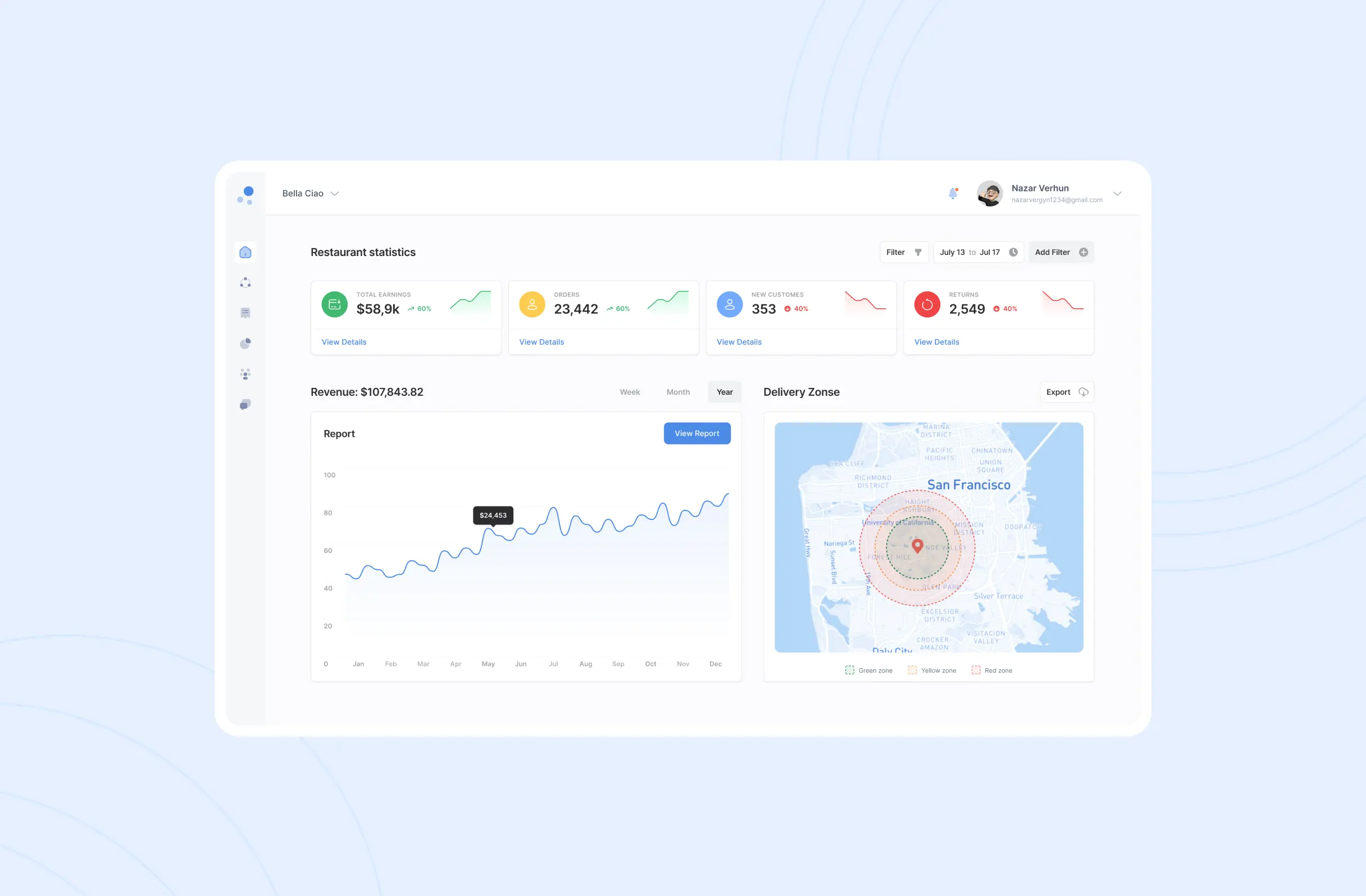
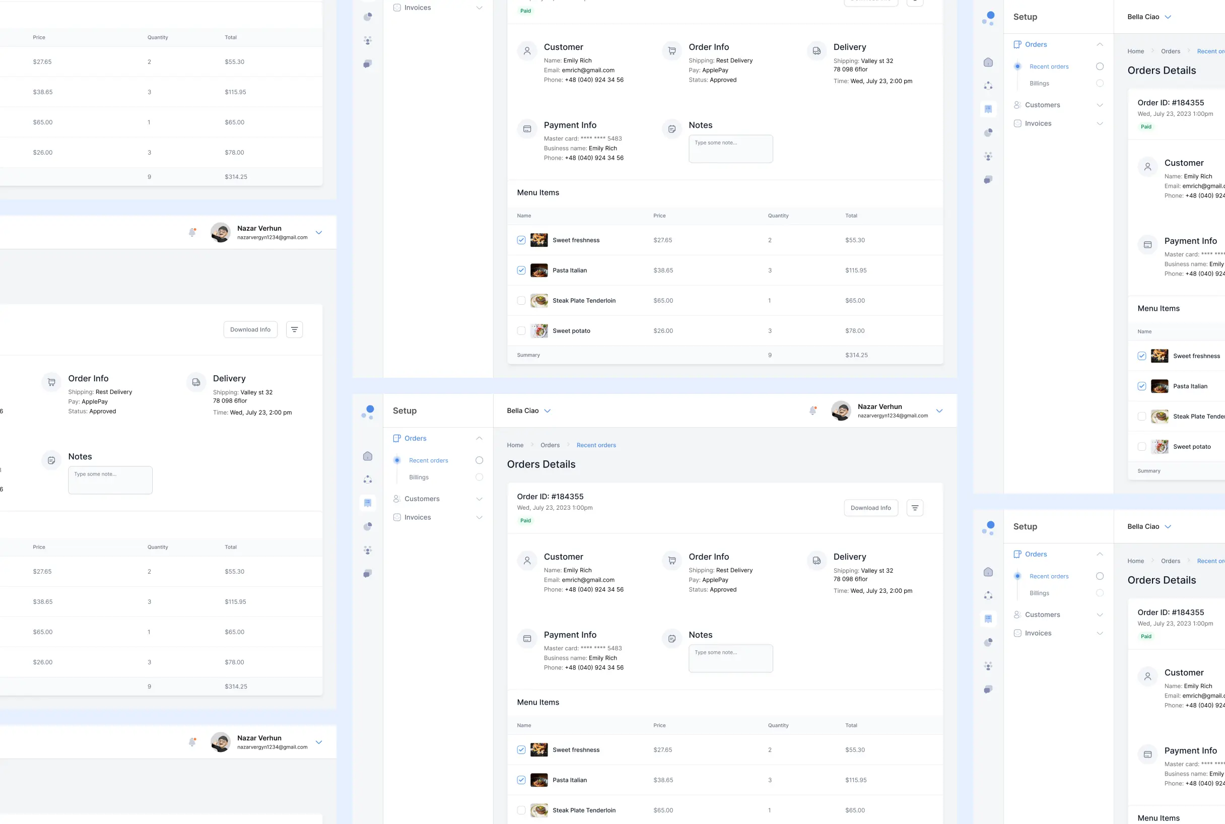
From there we designed a streamlined web platform focused on core restaurant functions: menu management, order processing, inventory control and delivery tracking. Working in agile sprints, our UX/UI designers and full-stack developers built intuitive workflows for both restaurant owners and their teams.
The build emphasised minimalist design with clean navigation, integrated payment solutions and comprehensive analytics, giving owners the data they need to make confident, informed decisions about day-to-day operations.
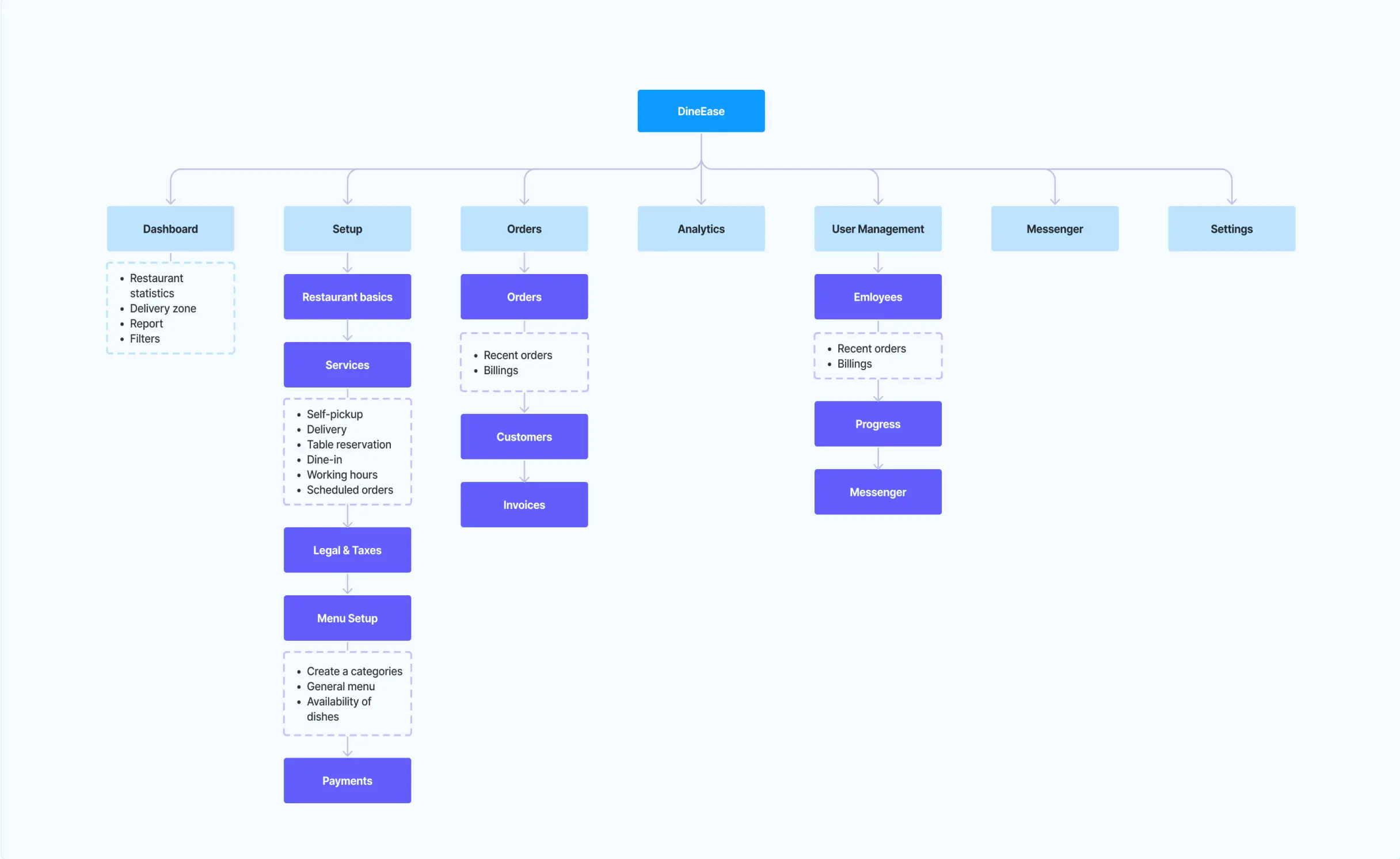
Information Architecture
Information architecture is a key element in designing a user-friendly and efficient digital system such as a food delivery app. It’s all about structuring and organizing information in a way that makes it easier for users to navigate, allowing them to easily access and understand content.
The information architecture below serves as a blueprint for the structure of the program, explaining how the various sections and their sub-sections relate to each other. This is important to create a convenient and efficient user experience that allows users to easily access and use the app’s features.
User interface design process
The user interface (UI) design process for the food delivery app project is centered around the principles of minimalism and user-friendliness, characterized by a clean and straightforward design style predominantly using light colors. This process encompasses several key steps.
Firstly, it begins with thorough research and user analysis to understand the target audience, their preferences, and pain points. The minimalist design is prioritized to reduce clutter and enhance the overall user experience. The chosen color palette features light colors like blue and gray to create a visually pleasing and soothing environment for users. The visual design phase finalizes the UI elements, including buttons, forms, menus, and content blocks. A consistent design language is maintained in alignment with the chosen color palette. Throughout this UI design process, the central focus remains on simplicity, clarity, and user convenience.
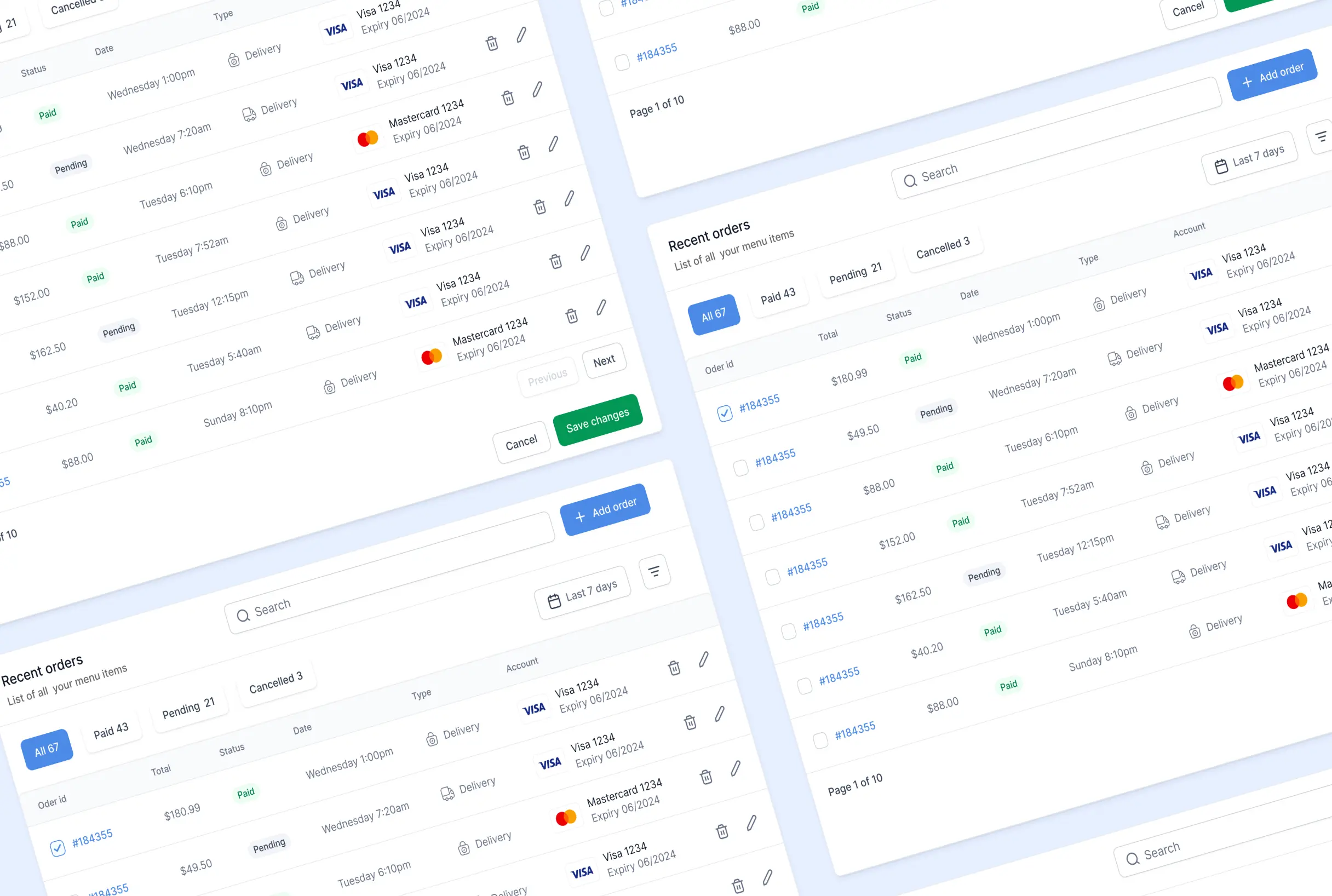
User capabilities
The food delivery app empowers restaurant owners and employees with a wide range of capabilities, streamlining their operations and enhancing the customer experience.
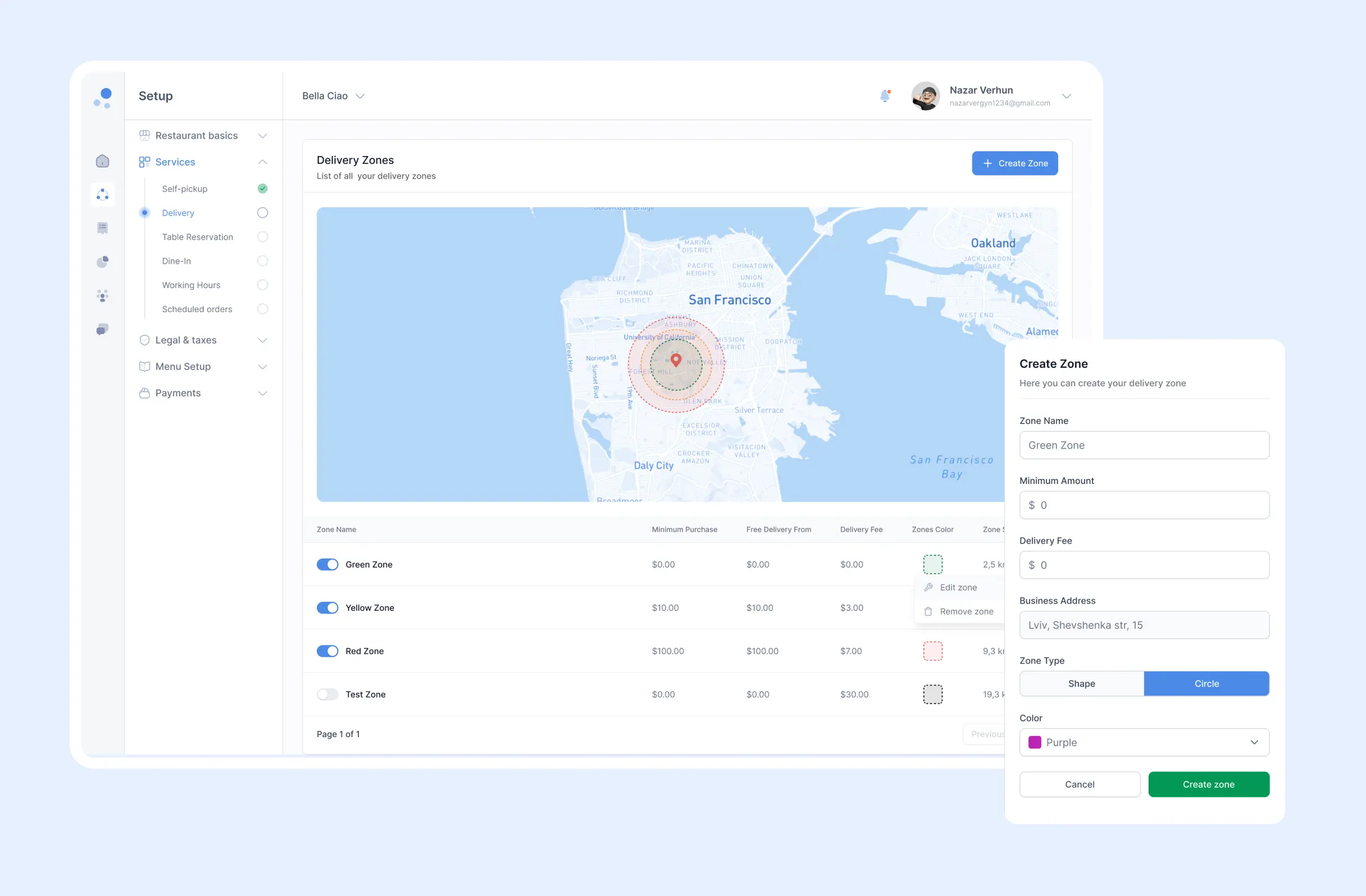
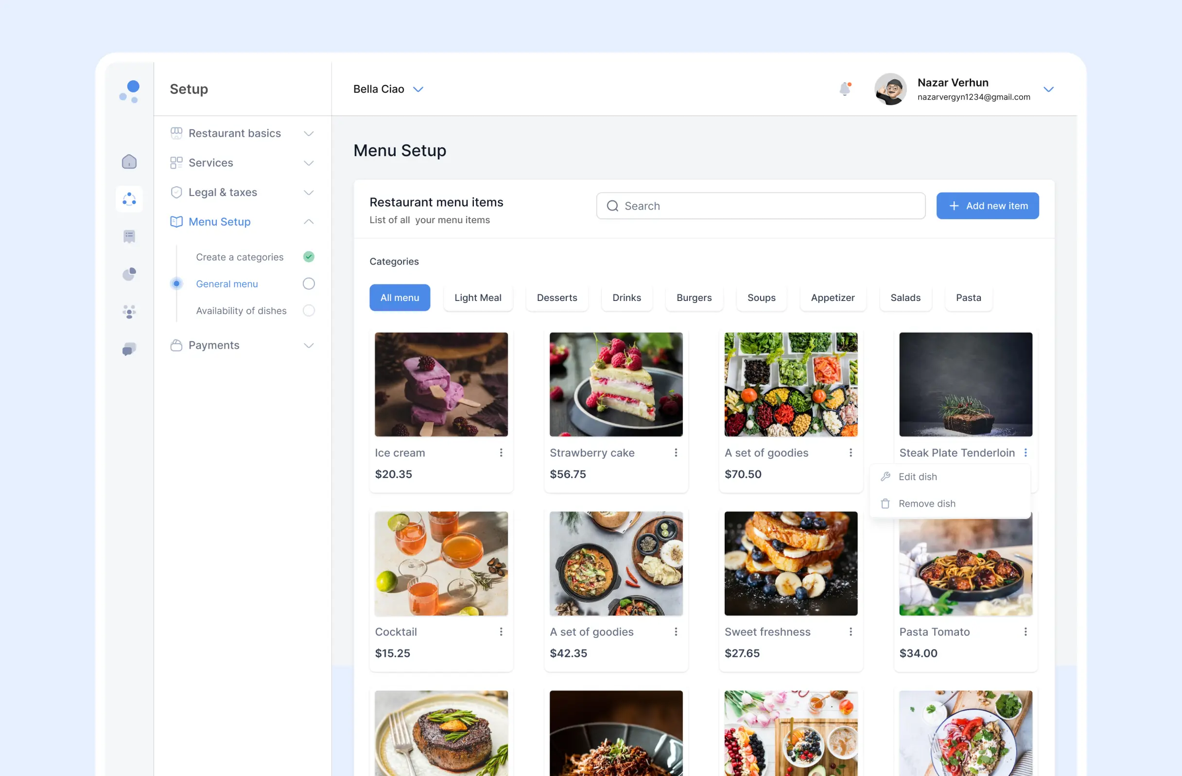
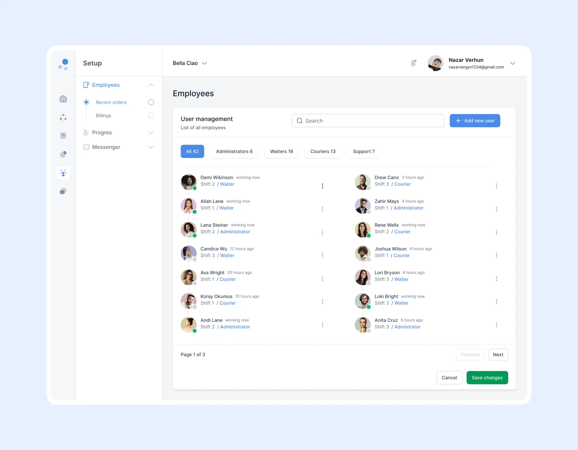
For restaurant owners, these capabilities include the ability to easily manage their menu, process orders efficiently, keep track of inventory, set prices and promotions, access analytics and reports for informed decision-making, and control employee access and roles. They can also efficiently manage food delivery by assigning and tracking delivery drivers.
On the other hand, restaurant employees benefit from functionalities such as order management, access to updated menus, delivery coordination, order status updates, internal communication tools, employee scheduling, and access to performance metrics related to their roles. These capabilities ensure smooth order processing, accurate food preparation, and efficient delivery, ultimately leading to satisfied customers and improved business success.
Result
We delivered a unified restaurant management platform that replaces several separate systems with a single dashboard for complete business oversight.
The navigation structure was optimised to give easy access to the main functions, the interface was reworked for clearer, more efficient use, and the sequence of user actions was rebuilt into a logical order of steps. The result is a faster, more comprehensible product that staff can master quickly and operate confidently under pressure.
FAQ
Couldn't find what you were looking for? write to us at hello@myplanet.design
What does the restaurant management platform cover?
It brings menu management, order processing, inventory control, pricing and promotions, analytics, employee roles and delivery tracking into a single web-based dashboard for owners and staff.
Who is the platform built for?
Both restaurant owners and their employees. Owners get full control over menus, pricing, inventory, analytics and staff roles, while employees get order management, updated menus, delivery coordination, scheduling and role-based metrics.
Why was information architecture so important here?
A food service system handles a large amount of information. A clear architecture structures menus, orders, inventory, delivery and reporting so users can navigate easily and access exactly what they need, which keeps service fast and accurate.
What design approach did you use for the interface?
A minimalist, user-friendly UI with clean navigation and a calm, light palette of blues and greys. Consistent buttons, forms and menus keep the focus on simplicity, clarity and speed, so staff can master the platform quickly.
Your first 7 days are free.
Scope a 1-month+ project
First 7 days free
Continue only if impressed
No risk · Real deliverables · Walk away after the week, no fee
A full week of our design team on your product — to kick off a 1-month+ engagement.
2 of 5 onboarding slots left this month