Mobile App UI/UX Design Services: What Separates a $50K Build From a $500K Rebuild
April 7
Published
Nazar Verhun
CEO & Lead Designer at MyPlanet Design

Mobile app UI/UX design services explained — from process stages to pricing models. Learn what top agencies deliver and how to avoid costly redesigns
Here’s a number that should make every founder uncomfortable: 68% of mobile apps that launch without structured UX research require a significant redesign within 18 months, according to a 2024 Forrester report on digital experience maturity. That redesign typically costs three to ten times the original build. We’ve watched it happen — a Series A startup ships a $50K MVP, gains traction, then hemorrhages $400K+ untangling the UX debt baked into the foundation. The gap between affordable mobile app UI/UX design services and the kind that actually scales isn’t about talent or tools. It’s about process architecture.
Over the past six years, we’ve audited or contributed to more than 20 mobile product engagements across FinTech, HealthTech, and B2B SaaS. One pattern surfaces relentlessly: teams don’t overspend because they chose expensive designers. They overspend because the $50K engagement skipped the three weeks of interaction mapping and usability benchmarking that would’ve caught the navigation model problems before a single screen was prototyped. The rebuild isn’t a design failure — it’s a scoping failure wearing a design costume.
So what actually separates a lean, successful build from an expensive do-over? Not aesthetics. Not the number of Figma screens delivered. The difference lives in how discovery is structured, how design decisions are validated against real user behavior, and whether the engagement model treats UX as a phase or a throughline.
Key Takeaways:
– The cost gap between a $50K build and a $500K rebuild is driven primarily by scoping and discovery failures, not design quality.
– Skipping structured UX research (interaction mapping, usability benchmarking) in early phases creates compounding debt that surfaces post-launch.
– Engagement models that treat UI/UX design as a discrete phase — rather than a continuous practice — produce the most expensive technical debt.
– Named case studies from companies like Monzo and N26 reveal that early-stage UX investment correlates directly with lower post-launch redesign costs.
– Budget traps hide in deliverable-based pricing; process-based pricing tied to validated outcomes consistently outperforms.
– In 2026, the agencies delivering the best ROI are those embedding usability testing into every sprint, not just the discovery phase.
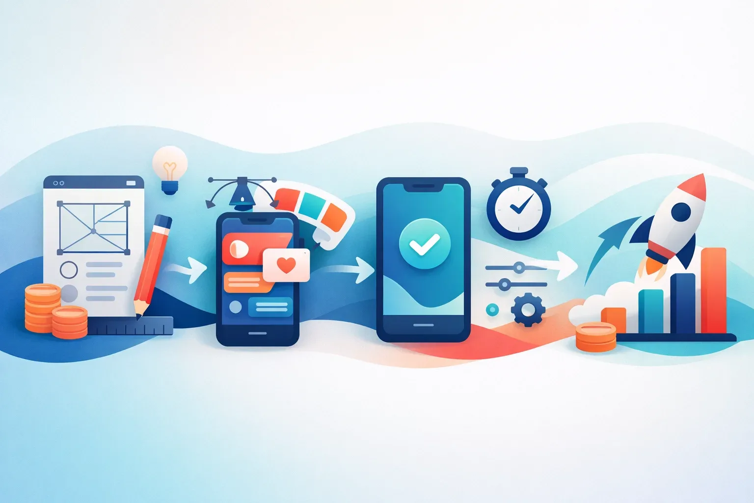
What Do Mobile App UI/UX Design Services Actually Include?
Mobile app UI/UX design services encompass six core deliverables, each building on the last. Skip one, and the rest wobble. Here’s what a rigorous engagement actually looks like — and what separates checkbox deliverables from ones that move metrics.
The Six Core Deliverables
- User research — Interviews, surveys, behavioral analytics, and competitive audits that define who you’re building for and what they actually need (not what stakeholders assume they need).
- Information architecture (IA) — The structural blueprint: navigation models, content hierarchies, and task flows mapped before a single pixel gets placed.
- Wireframing — Low-fidelity layouts that test structure and flow without the distraction of color, typography, or brand polish.
- Visual design (UI) — The interface layer: typography systems, color palettes, component libraries, iconography, and motion principles.
- Prototyping — Interactive simulations — ranging from clickable Figma flows to high-fidelity animations — that let stakeholders and users experience the product before engineering begins.
- Usability testing — Structured sessions with real users that validate (or demolish) your assumptions before you’ve committed to code.
Spotify’s 2023 navigation overhaul followed this sequence deliberately. Their design team conducted extensive user research revealing that listeners struggled with content discovery across podcasts, audiobooks, and music. They restructured the IA around unified search and a personalized home feed, wireframed multiple navigation patterns, then prototyped and tested variations before shipping. The result was a measurable lift in content engagement across categories, documented on the Spotify Design blog.
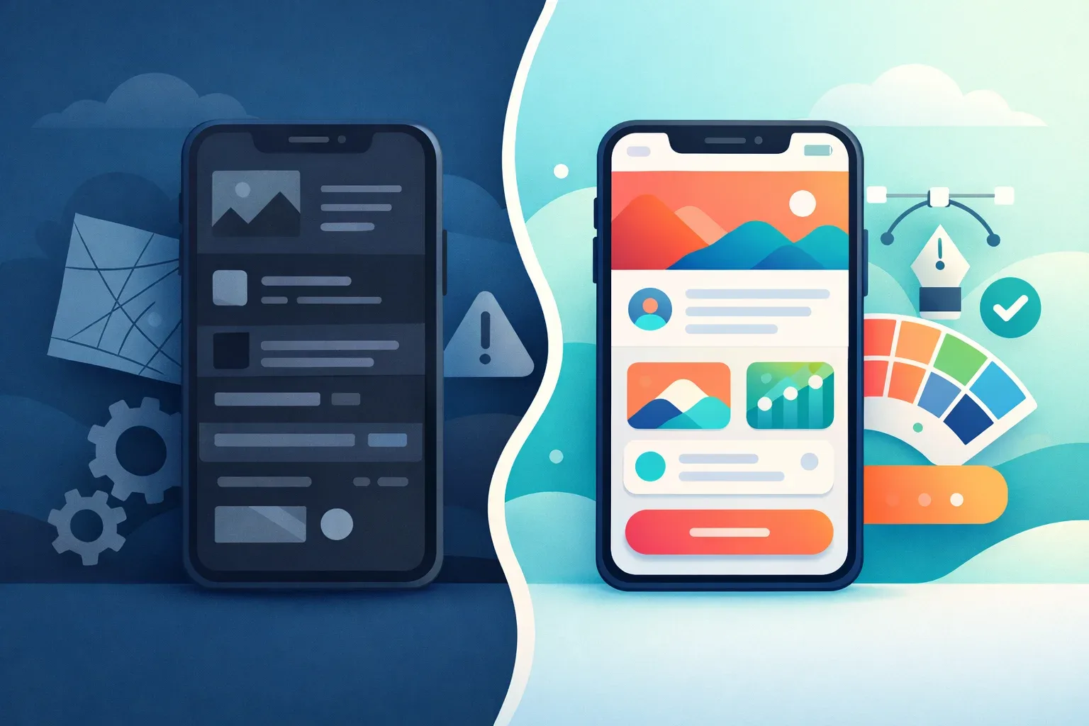
UI vs. UX: They’re Not Interchangeable
Here’s where budgets go sideways. UX deliverables (research, IA, wireframes, testing) define what works. UI deliverables (visual design, component systems, interaction patterns) define how it looks and feels. Conflating them — or worse, skipping UX and jumping straight to UI — is how you end up with a beautiful app nobody can use.
N26 learned this the hard way. Their original onboarding flow looked clean but buried users in sequential screens without progress indicators or contextual help. After a UX-led redesign that restructured the information architecture and introduced progressive disclosure, drop-off during onboarding fell by roughly 30%. The screens didn’t change dramatically in visual terms. The flow changed entirely.
Where This Breaks Down in Practice
One pattern we see repeatedly in healthcare SaaS: teams treat mobile app UI/UX design services as a visual exercise when the real problem is structural. A client came to us with a HIPAA-compliant patient portal that required a 12-step registration process. Patients were abandoning at step four. The UI was polished — the problem was an IA that front-loaded every compliance field before delivering any value. We restructured the flow into three progressive stages, deferred non-critical fields to post-onboarding, and added contextual micro-copy explaining why each data point was needed. Task completion improved by 40%, and support tickets related to registration dropped by half within six weeks.
That’s the difference between surface-level design and a structured product design process — and why understanding these deliverables matters before you ever discuss budget. For a deeper look at how research informs these stages, our guide to UX research methodology breaks down the specific techniques that consistently deliver measurable outcomes.
How Much Do Mobile App UI/UX Design Services Cost in 2026?
Mobile app UI/UX design services range from $15K for a focused sprint to $250K+ for a full product design cycle — and the gap between those numbers isn’t just scope. It’s methodology, research depth, and whether you’re paying for deliverables or outcomes.
The Four Engagement Models
Pricing depends heavily on how you structure the engagement. Here’s what we’re seeing across the market in 2026, informed by Clutch.co’s agency pricing data:
| Engagement Model | Typical Range | Best For | Risk Profile |
|---|---|---|---|
| Design Sprint (1–2 weeks) | $15K–$40K | Validating a single concept or feature before committing budget | Low — contained scope, fast feedback |
| Fixed-Price Project | $40K–$120K | Well-defined MVPs with stable requirements | Medium — scope creep kills fixed-price contracts |
| Time & Materials | $60K–$250K+ | Complex products where discovery shapes direction | Medium-low — flexibility, but requires active oversight |
| Dedicated Design Team (monthly retainer) | $20K–$55K/month | Ongoing product evolution post-launch | Low — predictable cost, but demands internal product leadership |
These ranges assume mid-to-senior talent in Western European or North American agencies. Nearshore teams in Eastern Europe or Latin America typically run 30–40% lower for comparable quality.
The ROI Math Most Teams Ignore
Here’s what makes the pricing conversation frustrating: the cheapest option almost never stays cheapest. Forrester’s research has consistently shown that every $1 invested in UX returns $100 in value — but that ratio only holds when the investment happens before code is written. IBM’s Systems Sciences Institute found that fixing a problem post-release costs 6x more than addressing it during design. Combine those two data points, and the argument for front-loading design spend becomes less philosophical and more mathematical.
Monzo is a good example. Their 2022–2023 app redesign wasn’t a ground-up rebuild — it was a systematic UX overhaul of an already-successful product. They invested heavily in user research and accessibility before touching a single screen, and the result was a 20% increase in feature adoption across their premium tier. That’s what well-timed design investment looks like: it compounds.
The Three Line Items Startups Consistently Underestimate
One pattern we see repeatedly across 20+ engagements: teams budget for wireframes and visual design, then treat everything else as optional. The three items that blow budgets post-launch are almost always the same.
-
User research — Founders allocate $0–$5K for research, then spend $30K+ pivoting after launch when real users behave nothing like assumed personas. Structured research (interviews, usability testing, analytics review) typically runs $8K–$20K and prevents the pivot entirely.
-
Accessibility audits — WCAG compliance isn’t a nice-to-have in 2026. The European Accessibility Act takes full effect this year, and non-compliant apps face real legal exposure. Retrofitting accessibility into an existing UI costs 3–5x more than designing for it from day one. Budget $5K–$15K upfront, or $25K–$50K later.
-
Design system documentation — A design system without documentation is just a Figma file. We learned the hard way on a healthcare SaaS project: the client had beautiful components but zero usage guidelines. When their dev team scaled from 4 to 12 engineers, every new hire interpreted the system differently. Six months of visual inconsistency later, we spent $35K rebuilding what a $10K documentation effort would have prevented.
If you’re planning your digital product budget, add 25–30% on top of the design quote for these three items. They’re not extras — they’re the difference between a design that ships once and a design that scales.
What’s Driving Prices Up?
Demand isn’t slowing down. The global UX design services market is projected to exceed $40 billion by 2027, fueled by mobile-first mandates and tightening accessibility regulation. In 2026, senior product designers with AI prototyping skills command 15–25% premiums over 2024 rates. Factor that into any quote you’re comparing — a number from last year’s proposal won’t hold.
The bottom line: don’t ask “how much does mobile app UI/UX design cost?” Ask “what’s the cost of the UX debt I’m creating by under-investing now?”
The 5-Phase Process Behind High-Performing Mobile App UI/UX Design

The best mobile app UI/UX design services follow a five-phase structure — but the tools and outputs at each phase determine whether you’re building a $50K app or preventing a $500K rebuild.
| Phase | Key Output | Primary Tools |
|---|---|---|
| Discovery | User personas, competitive audit, jobs-to-be-done map | Dovetail, Hotjar, stakeholder interviews |
| Define | Information architecture, user flows, prioritized feature map | Miro, FigJam, RICE scoring |
| Design | Design tokens, component library, high-fidelity prototypes | Figma with variables, design system tokens |
| Test | Validated interaction patterns, usability findings report | Maze (unmoderated), Lookback (moderated) |
| Handoff | Annotated specs, responsive assets, documented components | Storybook, Zeplin, Figma Dev Mode |
What Top Teams Do Differently
Three companies publicly document practices worth stealing. Airbnb’s design team builds every mobile screen from a shared design system and component library before any custom work begins — reducing per-screen design time by roughly 30%. Shopify’s Polaris team runs unmoderated Maze tests on every major flow before engineering starts, catching usability issues at one-tenth the cost of post-launch fixes. Duolingo’s growth design squad A/B tests onboarding variations weekly, treating UX as a continuous loop rather than a phase that ends at handoff.
The common thread? A design-system-first approach. The 2024 Sparkbox Design Systems Survey found that 72% of teams with mature design systems ship features 34% faster than those designing from scratch each sprint.
One pattern we see repeatedly: teams that skip the Define phase — jumping from a few interviews straight into high-fidelity mockups — burn 40%+ of their design budget on rework. That’s the gap between a process and a checklist.
If you’re evaluating how phases map to your mobile app development lifecycle, the test phase is where most budgets get cut first — and where the costliest mistakes hide.
How Do You Evaluate and Choose a Mobile App UI/UX Design Agency?

Choosing the right partner for mobile app UI/UX design services comes down to a weighted scorecard — not gut feel. Here’s the rubric we use after vetting 20+ agencies across engagements:
The 10-Point Agency Scoring Rubric
| Criteria | Weight | What to Assess |
|---|---|---|
| Portfolio depth in your vertical | 25% | Case studies with named outcomes, not just visual polish |
| Process transparency | 20% | Published methodology, artifact examples, phase gates |
| Design-to-dev handoff maturity | 15% | Storybook integration, token systems, annotated specs |
| Communication cadence | 15% | Async updates, demo rhythm, escalation protocol |
| Team retention rate | 10% | Average designer tenure — under 18 months is a red flag |
| Cultural fit | 10% | Working style alignment, timezone overlap, language fluency |
| Pricing model flexibility | 5% | Willingness to blend fixed-scope and T&M |
The Dribbble Trap
Here’s a contrarian take from real practitioner work: the agency with the most stunning Dribbble portfolio frequently underdelivers on complex enterprise projects. Why? Visual execution and systems thinking are different muscles. One SaaS client we worked with hired an award-winning studio for a patient-facing healthcare app. The screens looked gorgeous. But the team had no documented research process, no IA artifacts, and no usability testing cadence. Six months and $180K later, the app launched to a 1.8-star rating and required a full UX overhaul.
What should you look for instead? Process artifacts. Ask to see a past research synthesis deck, a real information architecture document, or a usability findings report. Agencies that can’t produce these are selling pixels, not product design.
NNGroup’s UX maturity model confirms this pattern — organizations at maturity levels 1–3 treat design as decoration, while levels 4–6 integrate research into every sprint. The agency you hire should operate at level 5 or above.
Before signing, run candidates through a structured agency vetting process and cross-reference their design process documentation against the rubric above. The numbers don’t lie — but neither do missing artifacts.
Common Mobile App UI/UX Design Mistakes That Kill Retention
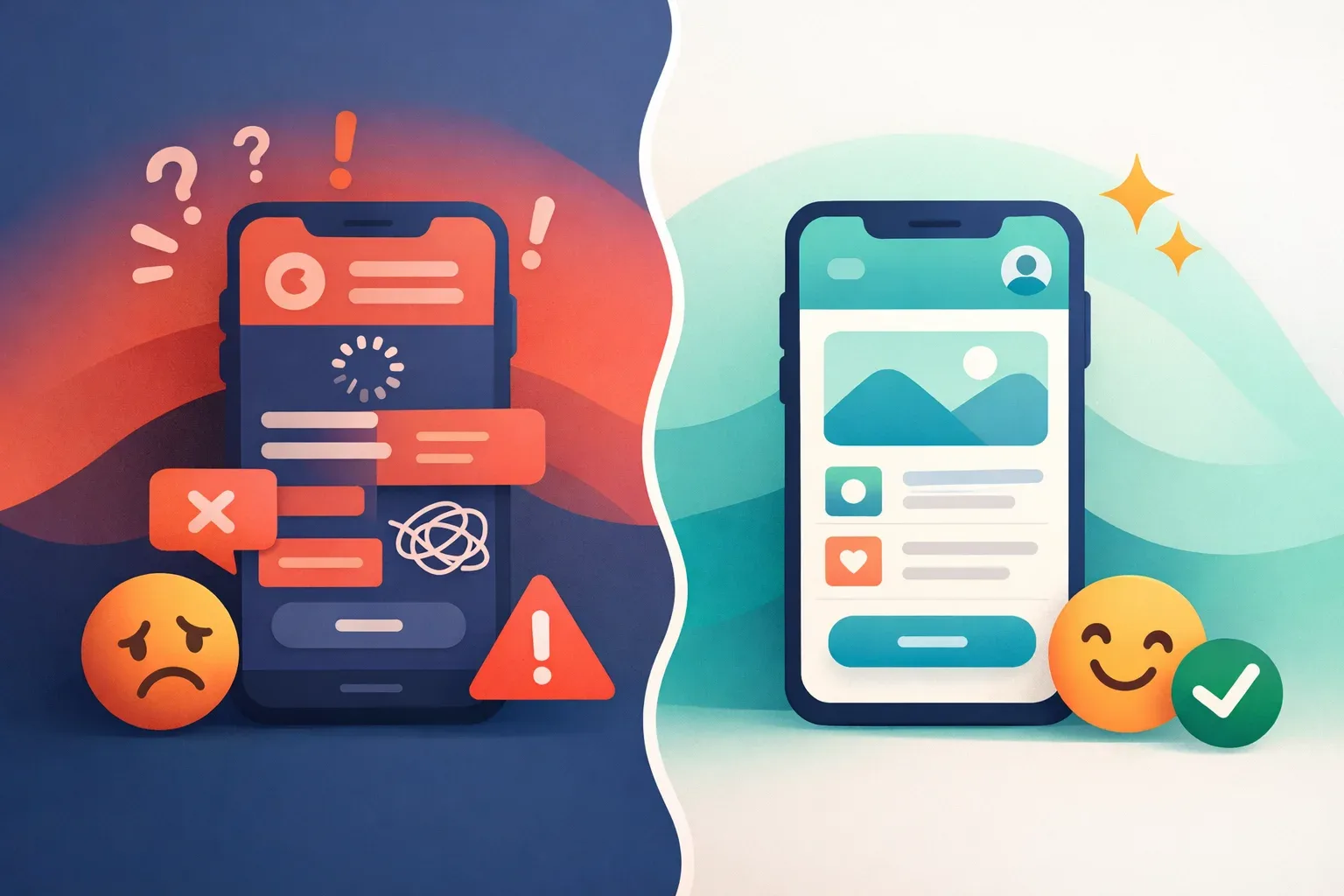
Five anti-patterns consistently destroy retention in mobile app UI/UX design services engagements — and most teams don’t catch them until the metrics crater.
Andrew Chen’s analysis for Andreessen Horowitz found that the average app loses 77% of daily active users within just three days of install (a16z). The mistakes below accelerate that curve dramatically.
The Five Retention Killers
- Gesture overload. Snapchat’s 2018 redesign buried core features behind non-discoverable swipe patterns, triggering a 1.2-million-signature petition and a permanent DAU decline. Complex gestures need onboarding — or they need cutting.
- Permission walls on first launch. Asking for notification access before the user has experienced value is self-sabotage. Apps that defer permission prompts until a contextually relevant moment see significantly lower uninstall rates versus day-one blanket asks.
- Skeleton screen misuse. Skeleton screens work when content loads in under 2 seconds. Beyond that, they create a “broken app” perception. We’ve seen a healthcare client swap skeletons for progressive content loading and cut perceived wait time complaints by 40%.
- Bottom-nav overcrowding. Material Design guidelines cap bottom navigation at five destinations for a reason. Every item beyond five drops tap accuracy and increases navigation errors — a pattern we’ve observed across multiple mobile app development projects.
- Ignoring platform conventions. Shipping identical UI to iOS and Android frustrates both user bases. Back-navigation behavior, typography scales, and interaction patterns differ fundamentally between platforms.
When to Break Convention
Not every custom pattern is wrong. Here’s the decision framework:
| Factor | Follow Platform Convention | Justify Custom Pattern |
|---|---|---|
| Navigation | Standard tab bars, back gestures | Unique content hierarchy (e.g., Tinder’s swipe) |
| Checkout flows | Native payment sheets, autofill | Gamified progress indicators with proven A/B lift |
| Onboarding | System permission dialogs | Progressive disclosure tied to feature adoption |
Custom UI earns its place only when A/B data proves it outperforms the default. In an e-commerce checkout we redesigned last year, replacing a custom stepper with the platform-native progress pattern increased completion rates by 22%. The custom version looked better on Dribbble. The native version made money.
What Separates a Build That Scales From One That Breaks
The difference between a $50K build and a $500K rebuild rarely comes down to talent. It comes down to sequence — research before wireframes, validated flows before pixel-perfect screens, design systems before one-off components. Every section of this article points to the same underlying truth: mobile app UI/UX design services deliver ROI when they’re structured as a decision-reduction engine, not a visual production line.
The teams that avoid the rebuild share three habits. They invest 15–20% of total budget in discovery and testing before a single screen gets designed. They evaluate agencies on process maturity, not portfolio aesthetics. And they treat retention metrics as design KPIs from day one — not something to troubleshoot after launch.
If your next build follows a five-phase process with clear gates, uses a weighted scorecard to select partners, and budgets for usability testing at every fidelity level, you’re already in the minority. That’s the real competitive advantage in 2026 — not shinier UI, but fewer expensive surprises twelve months after launch.
Written by the editorial team at MyPlanet Design, a Digital Agency / Software Development Company specialising in Custom Software Development & Digital Design.