Corporate Website for architect buro
Corporate website and brand identity for Federal, an architecture and construction firm. A polished, responsive web presence that showcases its projects, services and philosophy while building trust with prospective clients.
Client
Federal
Domain
Architecture & construction
Location
Dubai
Scope
Brand identity, corporate website design & build
Our role
Branding, web design and development
Year
2023-2025
25+
Screens designed and shipped
How we work
We started with a brand analysis and discovery workshops to understand Federal’s vision and market positioning. After competitor research we developed a complete visual identity system before moving into website design.
The design process focused on a professional, modern interface that presents architectural expertise through high-quality visuals and clear navigation. Our developers built a responsive site with interactive elements such as an embedded map and contact forms, all on clean, maintainable code architecture.
Throughout the engagement we collaborated closely with the client to make sure the final result reflected Federal’s professional standards and business goals.
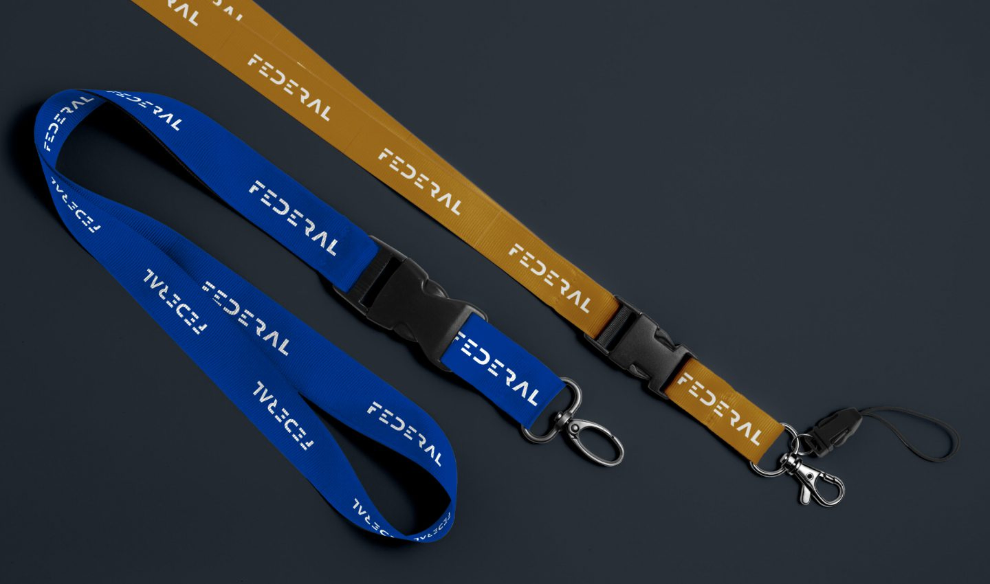
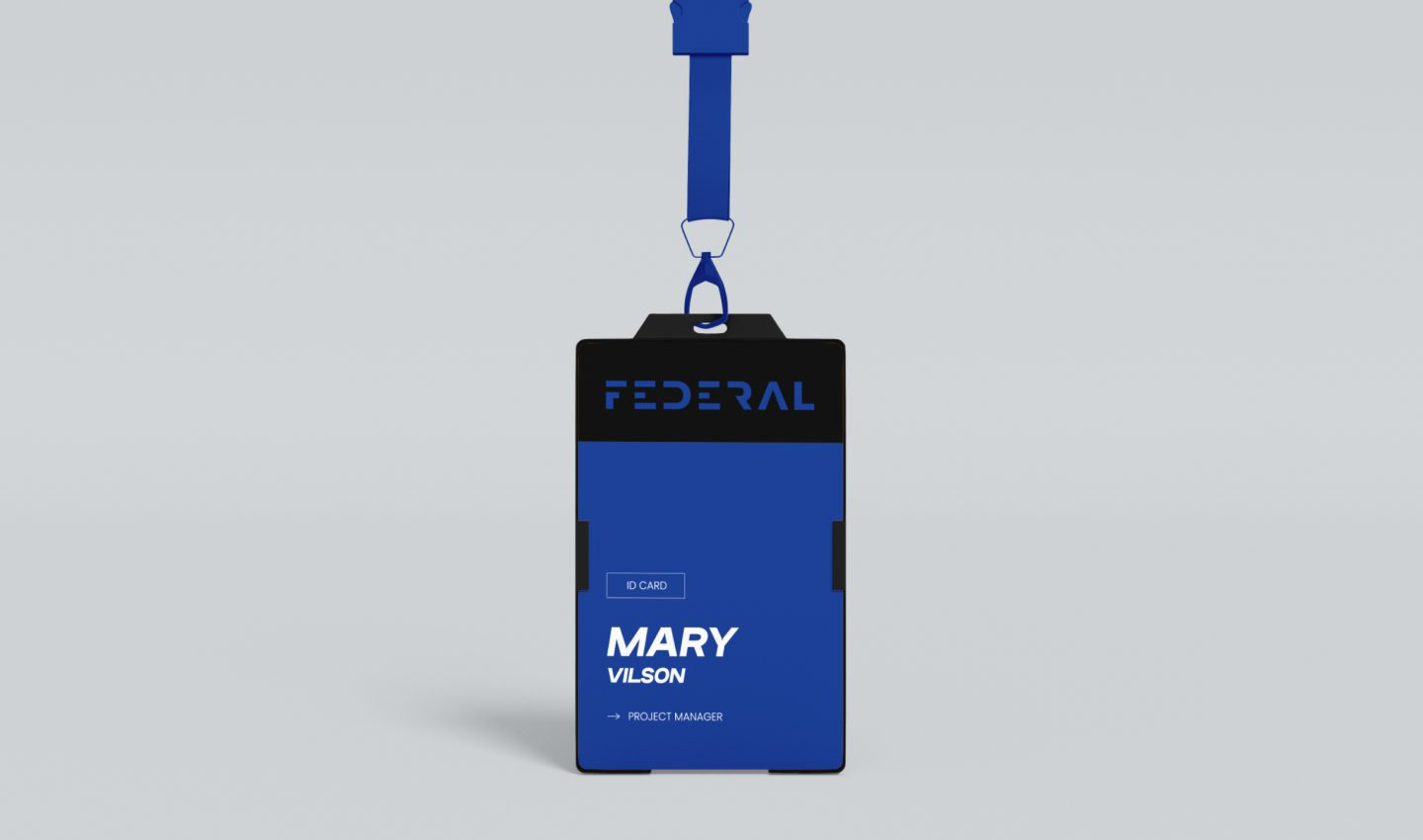
Branding
The branding for Federal Architectural Office embodies modernity, professionalism, and architectural excellence. Through strategic brand development, we created a coherent visual identity that positions the firm as a leading player in the architecture industry. The brand elements reflect the core values of innovation, quality, and timeless design.
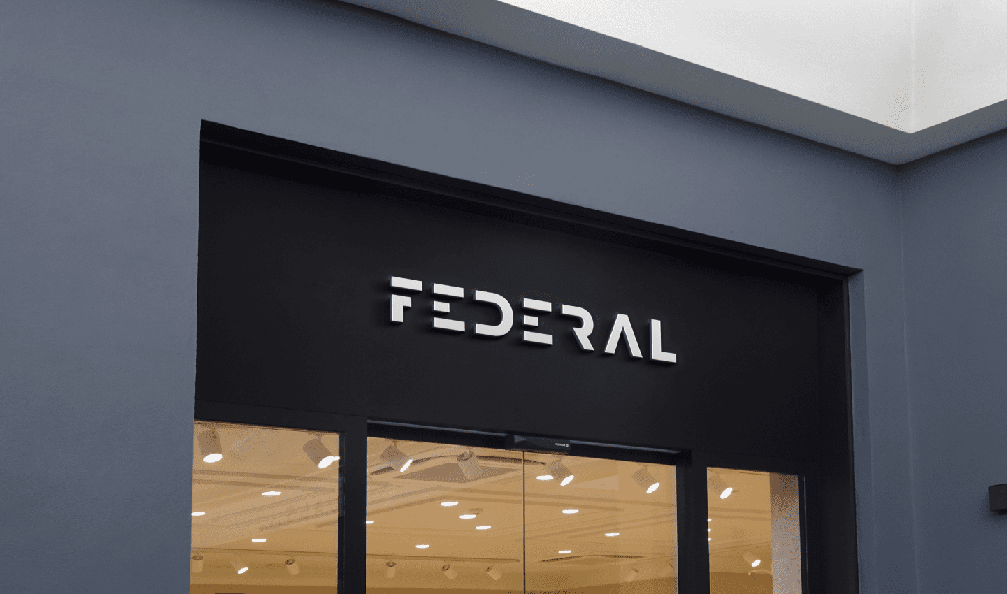

Logotype
The Federal logo embodies architectural precision and modern aesthetics. Its minimalist design communicates professionalism and reliability, while the clean lines reflect the company’s structural expertise. The logo design is versatile and works perfectly in both digital and print media.

Typography
Federal’s typography choices combine readability with a modern character. The selected typefaces convey authority and elegance while ensuring excellent readability across various screen sizes. The typographic hierarchy guides users intuitively through the content and reinforces the professional brand image.

Colors
The color palette for Federal was strategically developed to convey trust, modernity, and architectural sophistication. The carefully selected shades create a professional atmosphere and enhance readability and user guidance. The color scheme reflects the high-quality nature of the architectural services.

User Flow
The user flow for the Federal website was strategically designed to efficiently guide visitors through the company profile, services, and project portfolio. Every step of the user experience is designed to build trust and encourage potential customers to get in touch. The intuitive navigation minimizes friction and maximizes engagement.

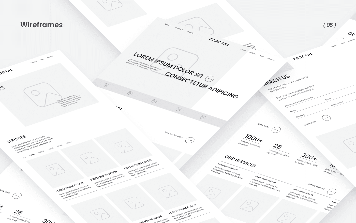
Wireframes & Design
The wireframes and design development for Federal followed a systematic approach to information architecture and visual hierarchy. Through iterative prototyping, we developed a structure that meets both Federal’s business objectives and the needs of its target audience. The final design perfectly balances aesthetics and functionality.
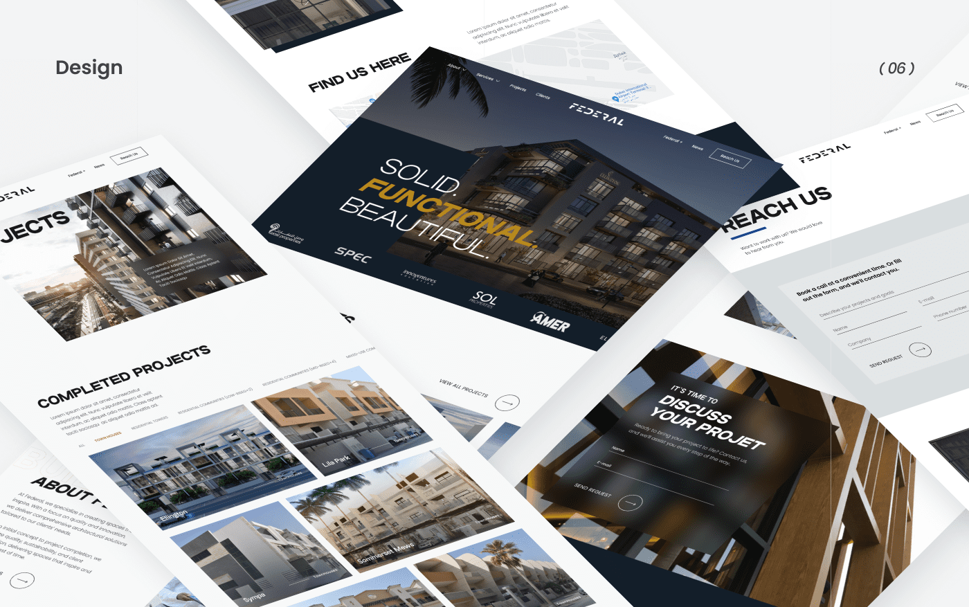
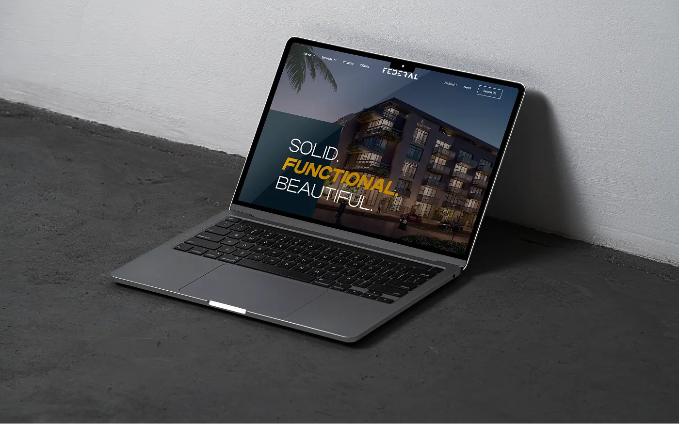
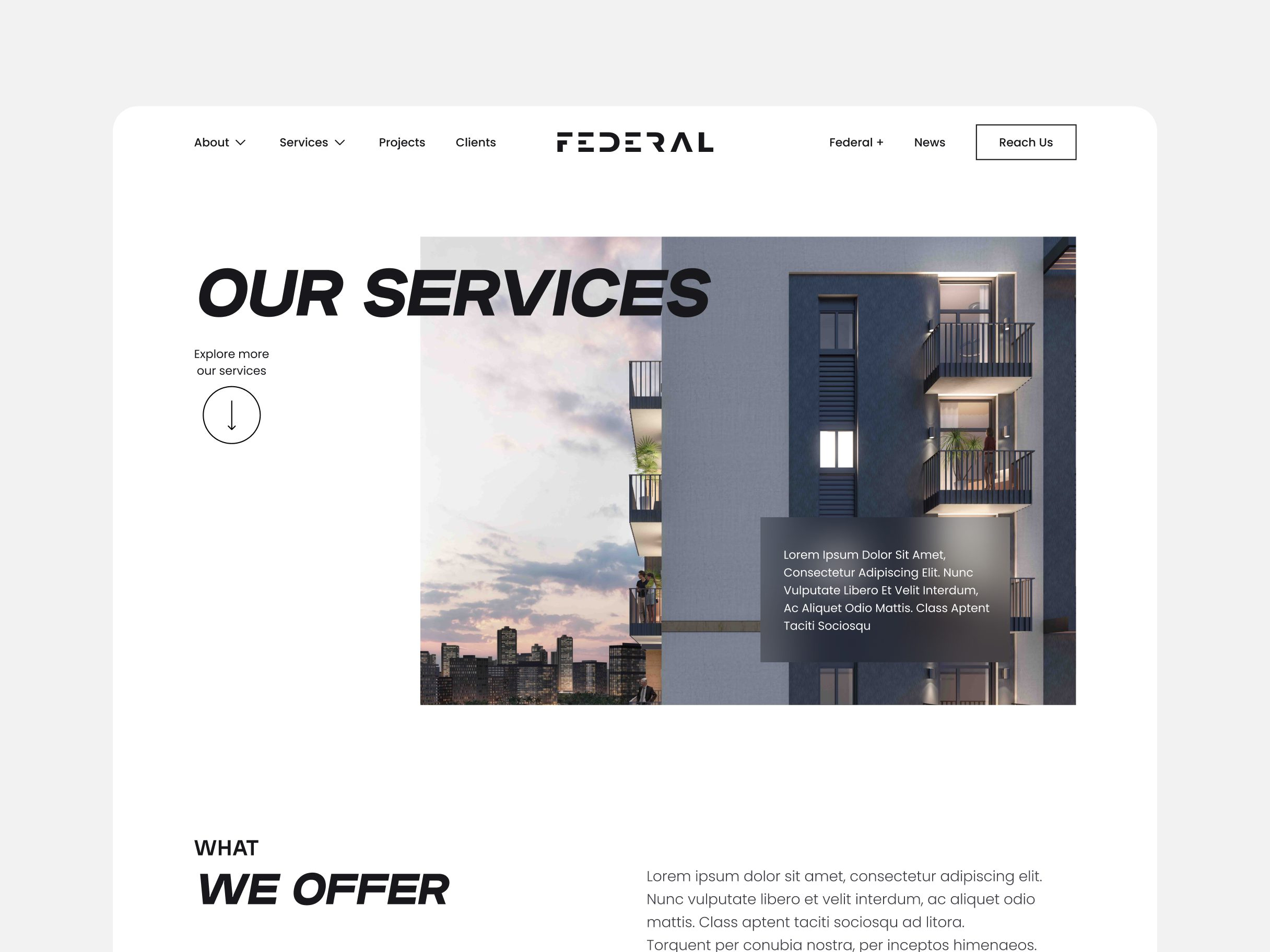
Home Page
The homepage serves as the central entry point to the Federal experience — bold, structured, and visually refined. From the very first screen, the design communicates confidence and clarity. A full-width hero image with a sharp tagline introduces the brand’s architectural philosophy, setting a tone of professionalism and modernism.

Additional pages
The additional pages of the Federal website were crafted to support the overall user experience and provide deeper insight into the company’s capabilities and approach. Each page maintains visual and structural consistency while focusing on specific user needs.
Reach Us
The Reach Us page simplifies communication, making it easy for potential clients to get in touch. Featuring an interactive map with the office location in Dubai, this page also includes essential contact details and a minimalist contact form. The layout is clean and professional, encouraging users to initiate collaboration.
Our Services
The Our Services page presents a clear and structured overview of everything Federal offers. Each service is displayed in a dedicated block with a brief description and supportive visual. From architectural design and engineering to permit approvals and interior planning — this section highlights the company’s multidisciplinary expertise in a user-friendly, digestible format.
Concept Design
The Concept Design page gives visitors a look behind the scenes of the creative process. It showcases how ideas are born and developed — through sketches, moodboards, and early digital models. The layout reflects the open and explorative nature of this phase, using generous white space, design quotes, and authentic visuals to build emotional engagement and convey the value of early-stage thinking.
Result
We reimagined the entire user experience with a focus on clarity, impact and engagement. The new design captures Federal’s core values – functionality, beauty and solidity – through a clean layout, bold typography and high-quality visuals.
The content was restructured to lead visitors through the company’s story, services and portfolio in a natural, intuitive flow. We introduced clear calls to action, interactive elements such as an embedded map and contact form, and a fully responsive design that adapts seamlessly to every screen size.
The result is a digital presence that not only showcases Federal’s expertise but builds trust and encourages meaningful client connections.
FAQ
Couldn't find what you were looking for? write to us at hello@myplanet.design
What did the project for Federal include?
A complete corporate web presence for an architecture and construction firm: brand discovery and identity, logo, typography and colour system, user flow and wireframes, plus a responsive website build with interactive elements like an embedded map and contact forms.
How is the website structured?
Around a clear journey through the company story. It includes a bold home page, a structured services overview spanning architectural design, engineering, permit approvals and interior planning, a concept-design showcase, and a contact page with an interactive map of the Dubai office.
How does the site build trust with prospective clients?
Through a professional, modern interface, high-quality visuals, intuitive navigation and clear calls to action. The user flow is designed to minimise friction and encourage visitors to get in touch and start a collaboration.
Is the website responsive?
Yes. The design adapts seamlessly to all screen sizes, so the experience stays clean and professional on desktop, tablet and mobile, built on clean, maintainable code architecture.
Your first 7 days are free.
Scope a 1-month+ project
First 7 days free
Continue only if impressed
No risk · Real deliverables · Walk away after the week, no fee
A full week of our design team on your product — to kick off a 1-month+ engagement.
2 of 5 onboarding slots left this month