Mobile app for team event creation & participation
GoodTeam is a mobile app for creating and joining corporate events. We designed a focused two-mode UI/UX system that lets hosts set up an event and team members RSVP in under a minute.

Product
GoodTeam
Domain
Corporate events, team coordination
Platform
Mobile app
Scope
UX research, two-mode UI/UX design system
Our role
UX/UI and product design
Year
2023-2025
20+
Screens designed and shipped
How we work
We approached GoodTeam with a clear constraint: no feature bloat. Corporate event apps tend to accumulate functionality – chat, polls, integrations, notifications, calendar sync, attendance tracking – until the core action is buried three taps deep.
Our UX process started by identifying the two jobs the app needed to do exceptionally well, and treating everything else as supporting context. We prototyped the navigation structure first, validated it through internal testing, and only then layered in secondary features.
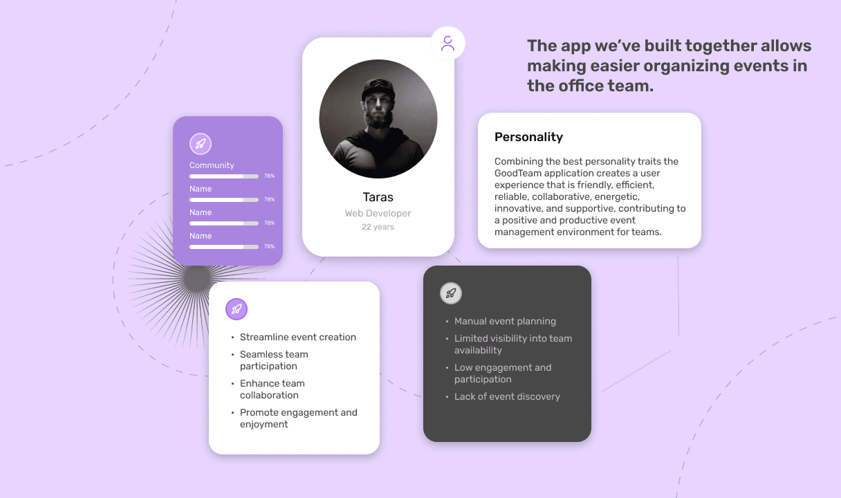
Personality
GoodTeam was designed with a friendly, low-friction personality — warm but professional, the kind of tool people open without feeling like they’re “using corporate software.” The visual language leans on soft shapes, generous spacing, and a confident color palette that signals approachability without sliding into childishness. Every microinteraction was designed to confirm what just happened, so users always know where they are and what their last action did.
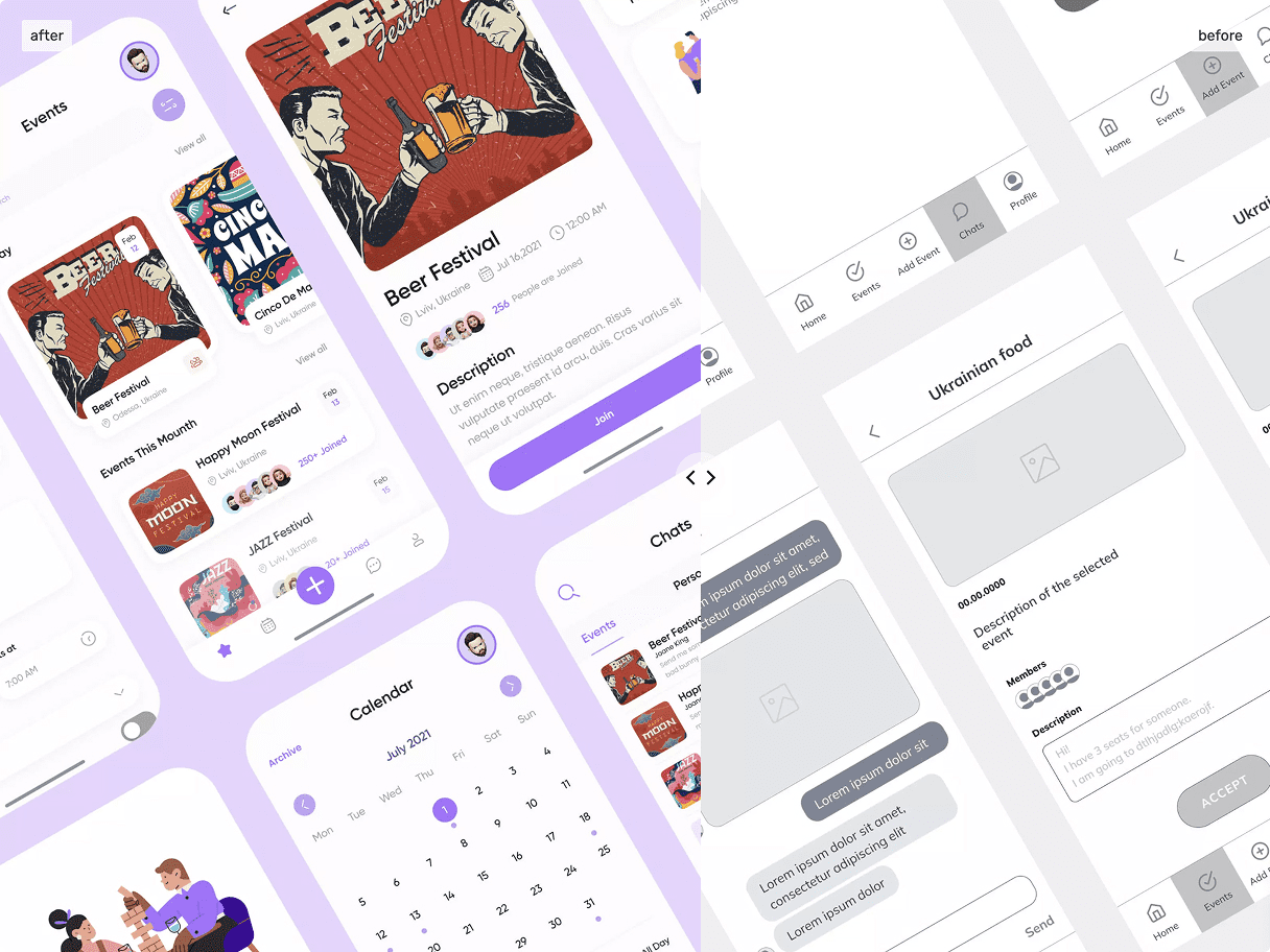
Two-Mode Architecture
The app’s structure is built around two modes that mirror how people actually use event apps in real life — you’re either the person creating something or the person responding to it. Organize mode gives hosts a fast path to set up an event, invite participants, and track responses. Attend mode gives team members a clean feed of events they’ve been invited to, with one-tap RSVP and the option to dive deeper if they want context. Switching between modes feels like switching contexts in your head, not navigating a menu.
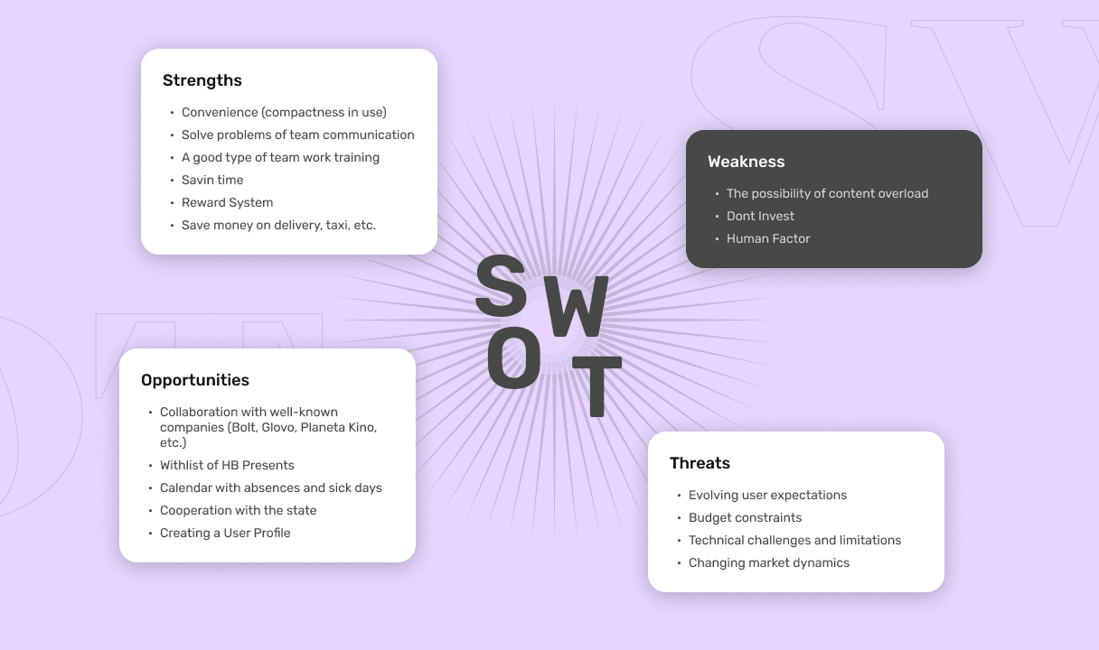
SWOT
Before designing a single screen, we ran a full SWOT analysis of the GoodTeam concept against the existing landscape of corporate event tools. The strengths were clear — a tightly defined use case (internal team events, not public ticketing) and a clean opportunity to compete on simplicity rather than feature count. The weaknesses were honest too: a crowded market, low switching incentive for teams already using Slack or Outlook for the same job, and the constant risk of scope creep turning the product into yet another over-engineered platform.
The opportunities shaped the entire design direction. Most competitors treat event creation as a heavy, form-driven process built for external audiences — conferences, ticketed events, public meetups. Internal corporate events have completely different dynamics: smaller groups, recurring patterns, lower formality, faster decisions. Designing for that gap meant we could strip away most of what makes traditional event apps feel bureaucratic.
The threats we documented — feature bloat pressure, calendar app competition, low engagement after initial novelty — became explicit constraints during design. Every feature proposal was tested against them: does this solve a real internal-event problem, or are we copying Eventbrite? That filter shaped what made it into the final product and what stayed out.
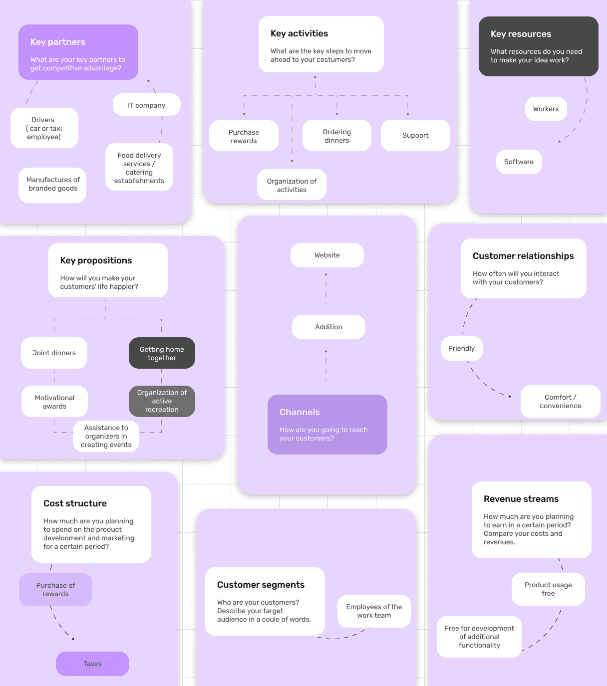
The Business Model Canvas
We mapped the full Business Model Canvas during the discovery phase to make sure design decisions stayed aligned with how the product would actually create and capture value. Customer segments were defined narrowly — mid-sized companies with distributed or hybrid teams, where coordinating internal events across locations is a real operational pain. Value propositions focused on speed and clarity: making event creation faster than writing a Slack message, and RSVP simpler than replying to an email.
Key activities and resources translated directly into product requirements — the app needed to work offline for participants, sync reliably across iOS and Android, and integrate cleanly with existing calendar systems without forcing teams to adopt yet another tool. Channels and customer relationships informed the onboarding flow: GoodTeam had to be usable within the first event a team organized, otherwise it would never reach the second.
The revenue and cost sides of the canvas guided what we deliberately didn’t design — no in-app payments, no premium feature gates, no analytics dashboards beyond what an HR coordinator actually needs. Keeping the canvas visible throughout the design process kept the team disciplined about scope, which is half the battle on internal product work.
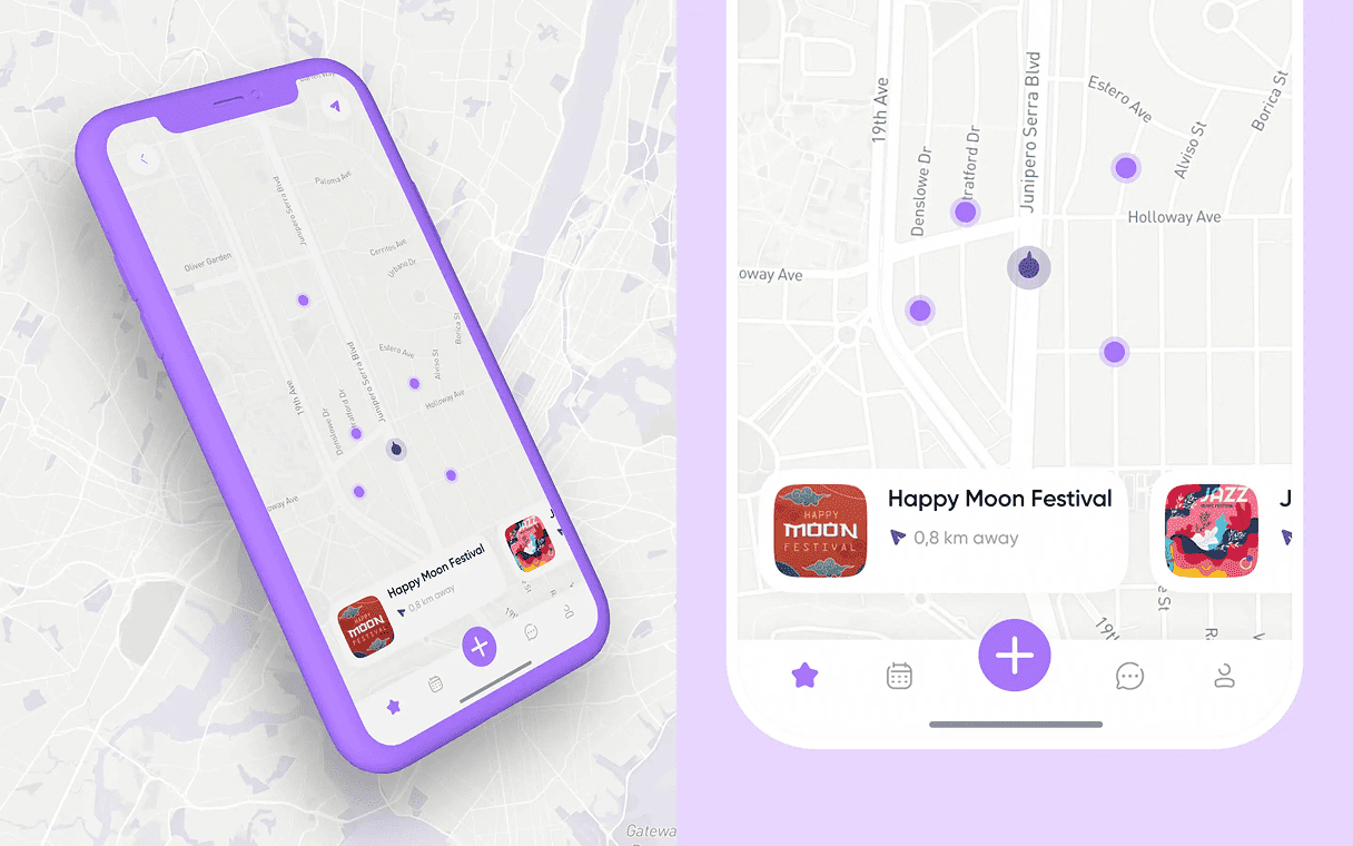
Interactive Map
The interactive map surfaces events geographically — useful for hybrid teams or larger companies with multiple offices. Users can spot what’s happening near them, filter by date or category, and tap directly into event details. The map is a discovery layer, not a primary navigation element, which keeps it useful without making it the centerpiece.
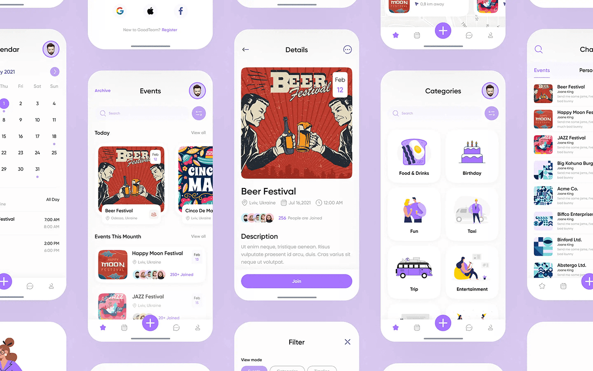
Events Managment
Inside event creation, the flow guides hosts through the essentials first — name, date, location, participants — and progressively reveals optional fields like agenda, notes, or attachments. This means hosts can publish a basic event in under a minute, or take the full path when the event genuinely needs more structure. The same form works for both, which removes the choice fatigue of “simple vs. advanced” mode toggles.
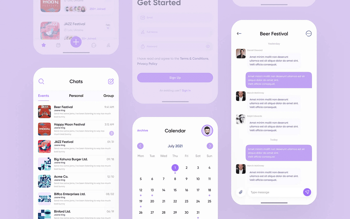
Organized Messenger
Each event has its own dedicated chat thread, scoped to participants and tied to the event lifecycle. Conversations stay focused on the event itself instead of bleeding into general team chat, and once the event is over, the thread archives automatically. It’s a small detail, but it solves the most common complaint about team apps — that messages from last week’s lunch are still pinging you a month later.
Result
We delivered a full UI/UX design system organized around two primary user intents – organize and attend – with all other functionality nested as contextual sub-flows that appear only when relevant.
The home screen makes it obvious within one second whether you are creating an event or responding to one. Secondary features like the interactive map, messaging, and event details surface naturally inside those two flows rather than competing for attention in the main navigation.
Ready to Build Your Next Digital Product?
From concept to launch in weeks, not months. Get an expert product team working on your mobile app, web platform, and design system.
FAQ
Couldn't find what you were looking for? write to us at hello@myplanet.design
How long does a build like this take?
A single surface like a marketing site or an MVP app typically ships in 4-8 weeks; a full multi-surface product - brand, web, mobile and a dashboard - runs around 12-16 weeks end to end.
Do you work with our existing codebase?
Yes. We audit the current stack first and either extend it or migrate incrementally, so you keep shipping while we improve the foundation underneath.
Who owns the code and design files?
You do. We hand over the full repository, the Figma design system and all source assets, with documentation so your team can keep building.
Can you cover web, mobile and backend together?
Yes - one team across product design, web, mobile and backend, sharing a single design system and API so every surface stays consistent.
Your first 7 days are free.
Scope a 1-month+ project
First 7 days free
Continue only if impressed
No risk · Real deliverables · Walk away after the week, no fee
A full week of our design team on your product — to kick off a 1-month+ engagement.
2 of 5 onboarding slots left this month