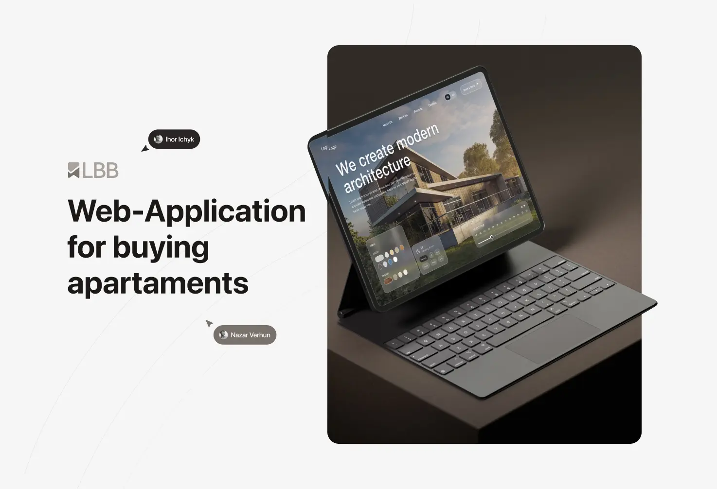
Syversten Web-Application for buying apartments
Syversten is a hybrid real estate platform that pairs apartment browsing with AI-powered interior visualization, letting buyers preview how any listing could look after renovation without leaving the page.
Client
Norwegian real estate company
Scope
UX/UI design & frontend implementation
Domain
PropTech / Real Estate
Our role
Product design & frontend
Year
2023-2025
20
Screens designed and shipped
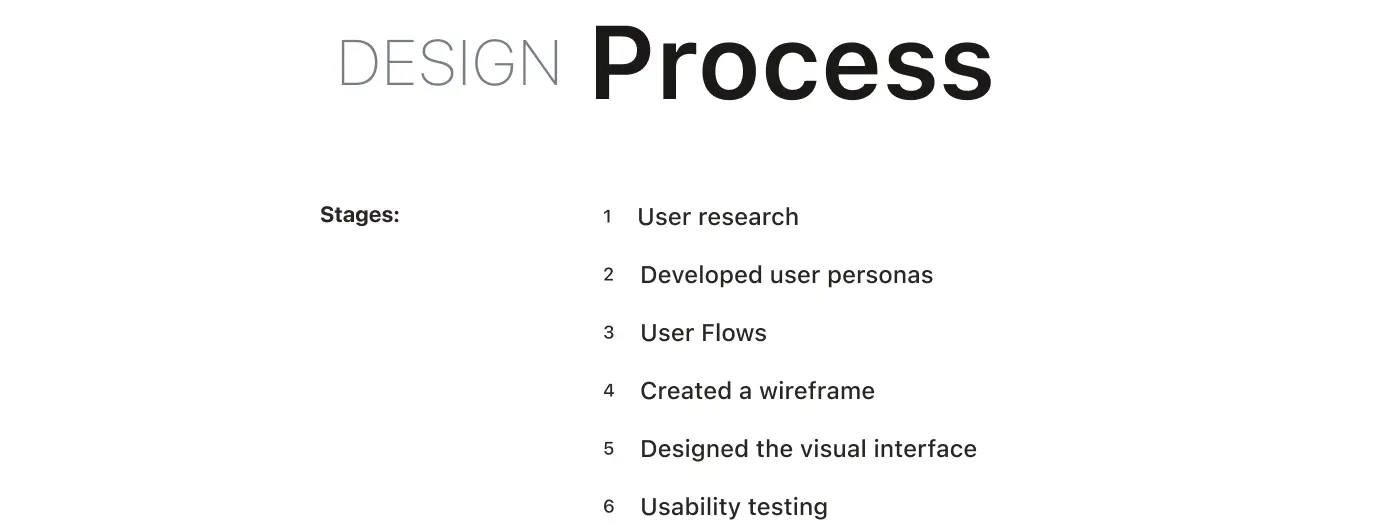
How we work
We opened with a discovery phase focused on understanding two very different user mental models living inside one product: the casual browser scrolling through listings, and the engaged buyer experimenting with renovation ideas. Our UX team mapped both flows separately before designing the transitions between them, while our frontend developers prototyped the AI visualization layer in parallel to validate technical feasibility early.
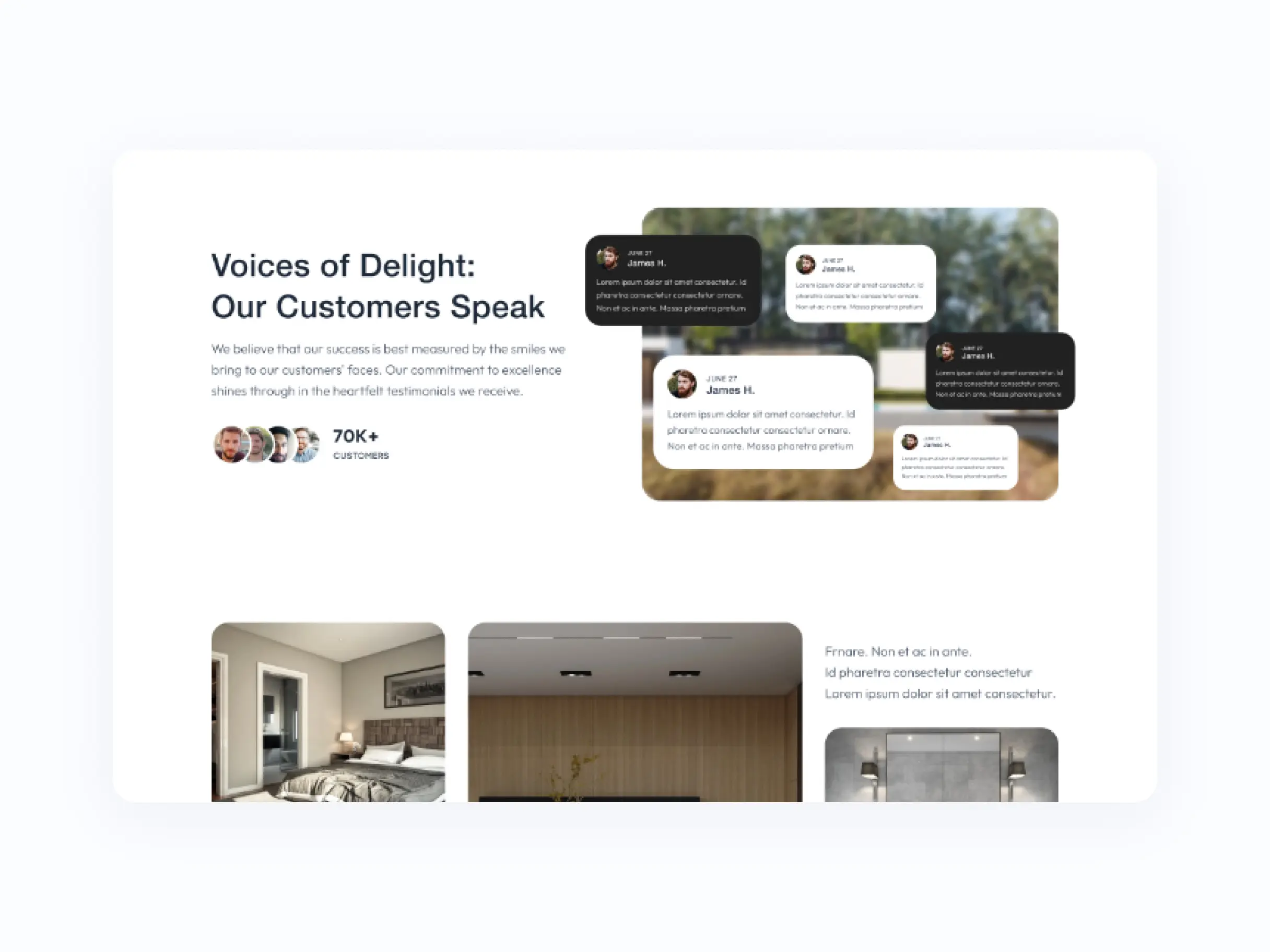
The team operated in weekly sprints with direct client communication, iterating on designs based on real usage scenarios rather than assumptions, so every decision was grounded in how buyers actually behave.
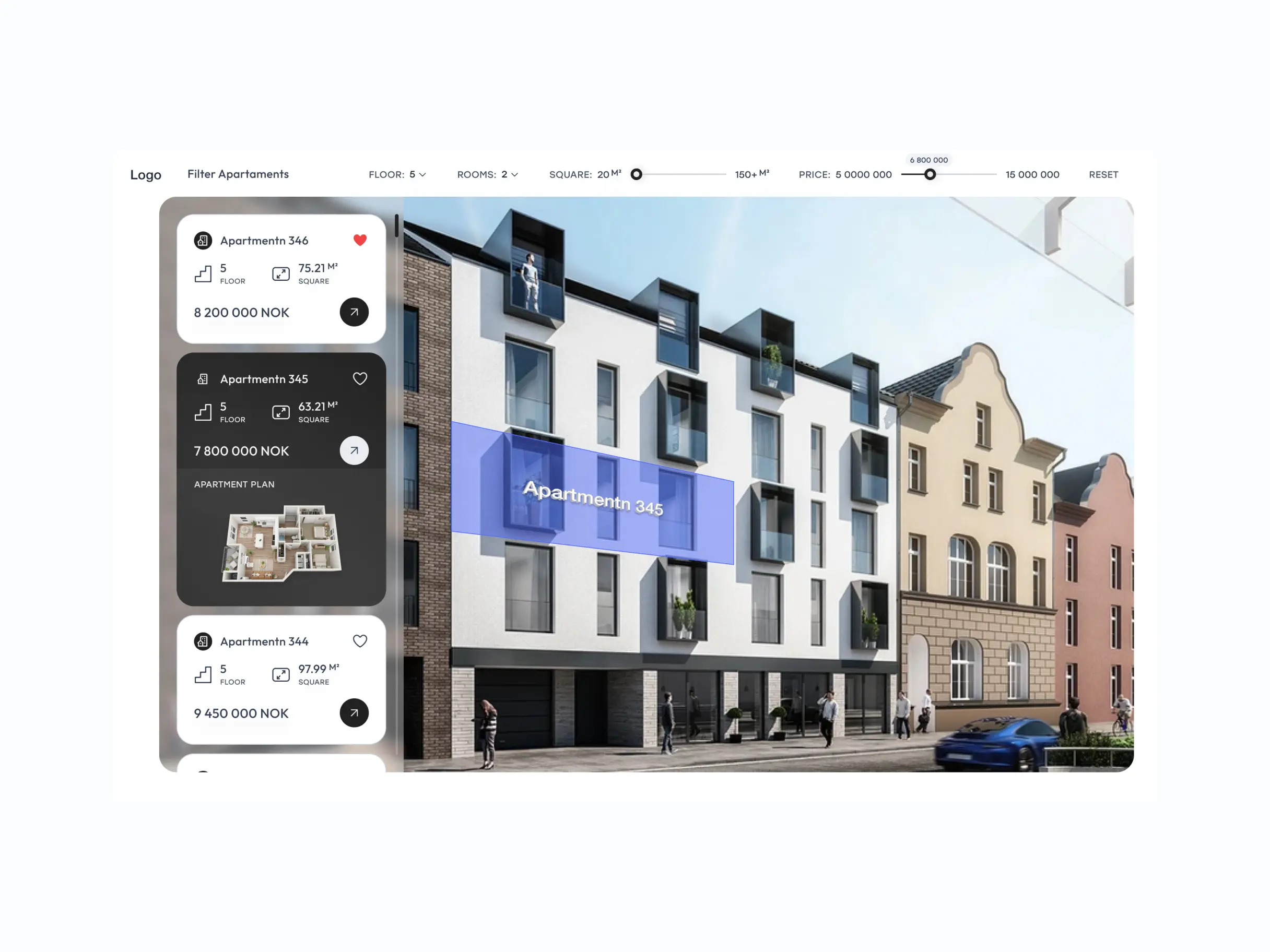
Landing Page Overview
The landing page introduces Syversten’s hybrid approach within the first scroll — a clear value proposition, a short demo of the AI visualization in action, and a transition into the property browsing flow. We avoided the typical PropTech cliché of generic city skylines and instead used real apartment renders generated through the platform itself, reinforcing the product’s core promise.
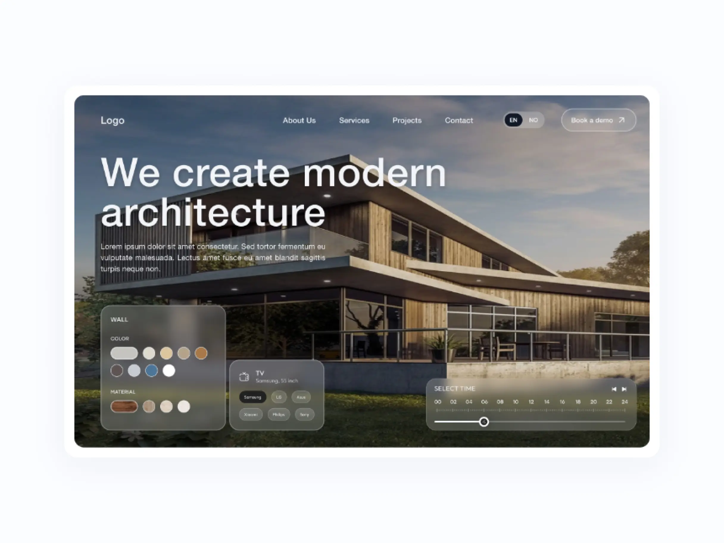
App Overview
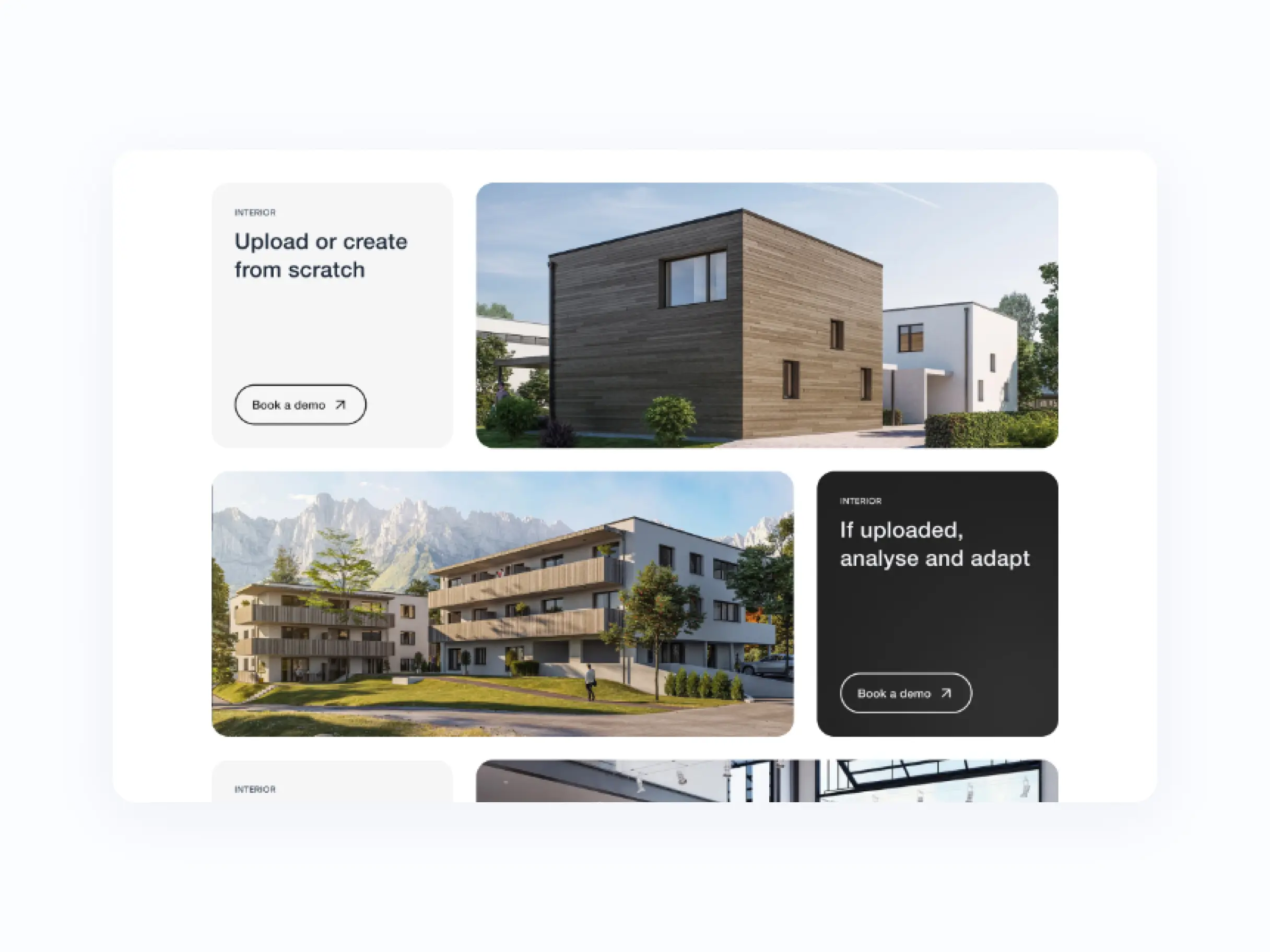
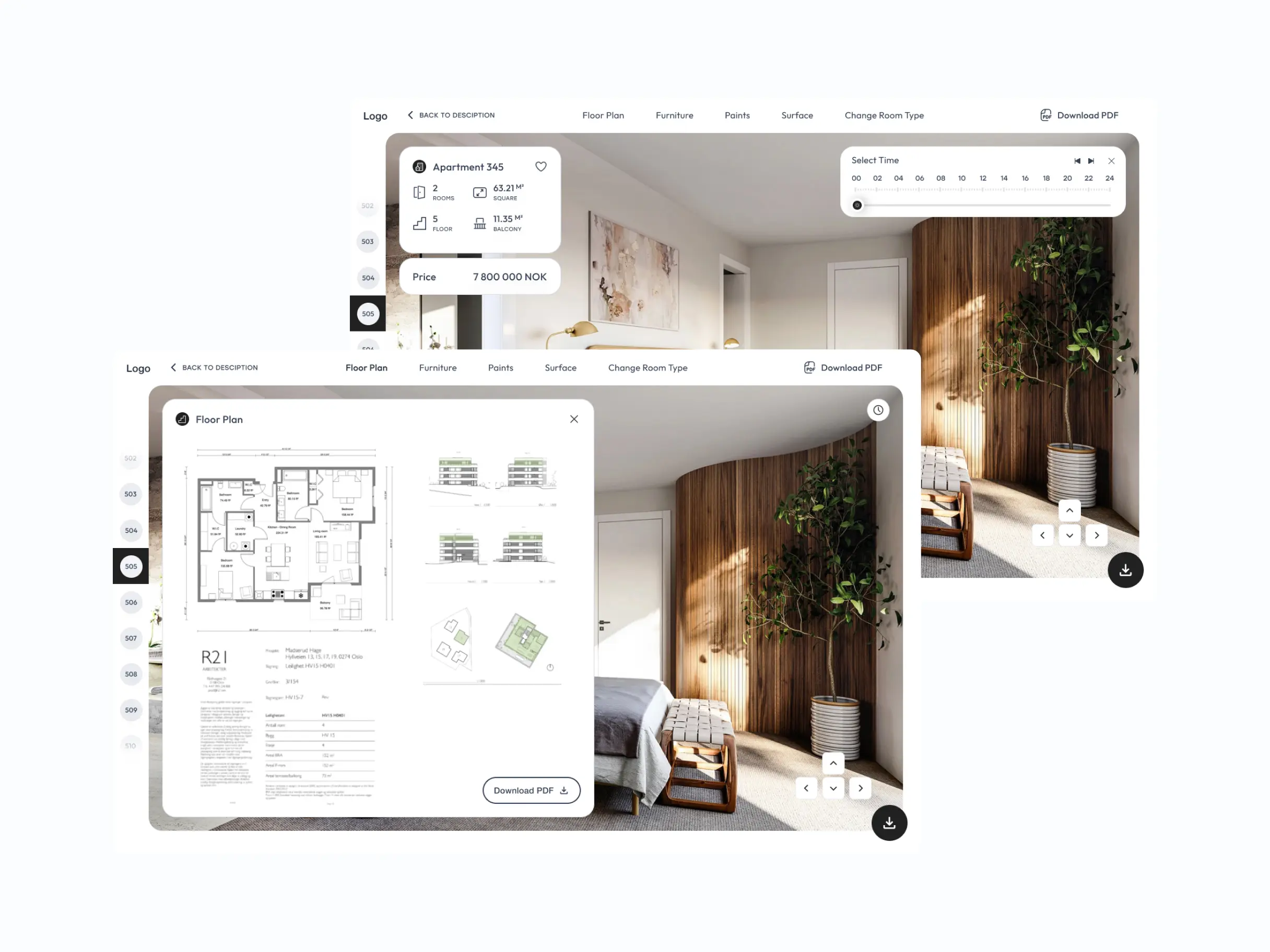
Inside the app, the experience is organized around two intentional modes. The browsing mode behaves like a familiar real estate marketplace — filters, map view, saved properties. The visualization mode opens directly from any listing and lets users experiment with the space itself: different interior styles, furniture configurations, and renovation scenarios powered by AI. The transition between modes is designed to feel like a natural next step, not a separate tool, which is what makes the hybrid approach actually work for buyers rather than just sounding good in a pitch.
AI Integration as a UX Decision
The biggest UX challenge in any AI-powered product isn’t the AI itself — it’s helping users trust it without turning the process into a black box. For Syversten, we deliberately designed the AI as a visible tool, not magic happening behind the curtain. Users can see which inputs the system is using — room dimensions, style preferences, material choices — and adjust any suggestion directly. This transparency mattered more than any algorithmic optimization: it turns a skeptical buyer into an active collaborator who shapes the result, rather than passively accepting it.
Two Audiences, One Interface
Syversten had to work for two very different user groups — first-time buyers visualizing an apartment for the first time, and professional interior designers running through multiple variants quickly. Instead of building two separate modes or overloading the interface with every possible option, we used progressive disclosure: simple tools are immediately visible, advanced features appear only when the user signals they’re needed. Beginners are never overwhelmed, and professionals are never slowed down by training-wheel UI.
Performance as a Design Constraint
Real-time visualization in the browser sets hard limits — anything over a two-second delay breaks the feeling that you’re actually interacting with the space. Performance wasn’t a technical side-concern in this project; it was a design decision running through every screen. We reduced the number of options visible at once, optimized asset loading based on what the user was actually looking at, and designed transitions that shorten perceived wait time rather than trying to mask it. Speed became part of the visual language, not just a technical metric.
Result
We delivered a complete UX/UI system and frontend implementation built around two seamlessly connected modes. The browsing experience stays clean and conventional: users can filter, compare, and shortlist apartments without friction. Once a user opens a listing, the AI visualization layer activates, letting them swap finishes, generate furnished variants, and adjust lighting in real time.
Around 20 screens were designed and shipped, covering the full journey from search to visualization to inquiry.
Ready to build your PropTech platform?
Let us turn your property data into an experience buyers connect with. From UX strategy to AI-powered visualization and frontend delivery, we build real estate products that sell.
FAQ
Couldn't find what you were looking for? write to us at hello@myplanet.design
What is the Syversten platform?
Syversten is a hybrid real estate platform that combines apartment browsing with AI-powered interior visualization, so buyers can preview how a listing could look after renovation without leaving the page.
How does the AI interior visualization work?
The visualization mode opens directly from any listing and lets users experiment with the space through AI-powered interior styles, furniture configurations, and renovation scenarios, swapping finishes and adjusting lighting in real time.
Who is the platform built for?
It serves two audiences at once: first-time buyers visualizing an apartment for the first time, and professional interior designers running through multiple variants quickly, using progressive disclosure so neither group is overwhelmed or slowed down.
What did MyPlanet Design deliver?
We delivered a complete UX/UI system and frontend implementation built around two seamlessly connected modes. Around 20 screens were designed and shipped, covering the full journey from search to visualization to inquiry.
Your first 7 days are free.
Scope a 1-month+ project
First 7 days free
Continue only if impressed
No risk · Real deliverables · Walk away after the week, no fee
A full week of our design team on your product — to kick off a 1-month+ engagement.
2 of 5 onboarding slots left this month